NBA team logos have little to no effect to the team’s performance. However, they do play an important role when it comes to branding and marketing purposes. But more importantly, logos give us a glimpse of a franchise’s identity, culture, and history.
Like all pieces of art, none of them are built the same. Some franchises have showcased logos that are next to perfect, as they capture a franchise’s identity with great measure. On the other hand, some are just too plain and boring. While others have failed to make a solid logo, some of them still manage to become memorable given the franchise’s rich tradition and history. For this piece, let’s rank the NBA logos.
Best NBA Logos Ranked
30. Detroit Pistons
Year released: 2017
The Pistons haven’t all been great in the past few years and their logo has been just as forgettable. The franchise might want to consider bringing back the horse logo they sported back in 1996. It was a memorable logo that personified some of the team’s most successful years.
See our new logo on our new court at @LCA_Detroit through the magic of our virtual venue tour.
Go here -> https://t.co/jUbhcnT0gk pic.twitter.com/T9VPciI5hg
— Detroit Pistons (@DetroitPistons) May 17, 2017
Their current logo only shows the name of the team over a basketball. While it does go well with the logo trend of teams going for badge-like logos, it doesn’t really do any justice to a franchise known for its scrappiness and defiance with an underdog mentality.
29. Brooklyn Nets
Year released: 2012
Brooklyn is no doubt one of the best teams in the NBA today. Despite the Kyrie Irving situation, Kevin Durant and James Harden have so far picked up the slack established the Nets as a legitimate championship contender. Unfortunately, the Nets’ logo isn’t as stellar, especially compared to their previous logo iterations. As a result, they rank 29th in this list.
The Nets’ current logo only sports a shield that with the words Brooklyn and a basketball that contains the letter “B”. Although this is decent at the very least, there’s no question that it could’ve been better.
Brooklyn Nets logo is so bad. How do you manage to go backwards from such a great one… pic.twitter.com/sSd3XLETkw
— • (@heatbyhenry) January 8, 2021
Before their current one, the Nets logo had a 3D effect that showed more attention to detail. Furthermore, the special effect gave it more flare. Unlike their logo today, it’s also worth noting the blue, red, and white colors gave it a better look. The current logo only sports a black and white scheme. While this gives the logo a minimalist look, the design is too plain that it doesn’t make it stand out by miles.
28. Indiana Pacers
Year released: 2017
The Pacers have always been dark horses in the NBA. Although they’ve always managed to stay competitive by making the playoffs in four of the last five years, the Pacers have never won a championship. Because of this, the Pacers are always overlooked. Like their logo, they simply doesn’t stand out from the rest of the field.
The Pacers new jerseys, alternate logo and floor design: pic.twitter.com/RMhHmqrVbD
— NBACentral (@TheDunkCentral) July 28, 2017
The Pacers currently have a logo that goes well with the modern trend. However, the problem is the logo is relatively too old. While the franchise has changed logo five times throughout history, there aren’t really major differences among them. Although some would say the lack of changes symbolize a franchise’s consistency and stability, the franchise’s history with no championship success to show for it doesn’t really elevate the logo’s value. Furthermore, they should really start considering their logo as the P to the Pacers.
27. Houston Rockets
Year released: 2019
Throughout NBA history, the Rockets have had five different logo designs. Although it’s not really their best design, a lot of fans remember the Rockets’ logo from 1973 to 1995 as the franchise won back to back championships in ‘94 and ‘95.
However, their best design was their new logo unveiled in 2003. Designed by Japanese design artist and Academy Award winner, Eiko Ishioka, the Rockets’ logo showed an “R” symbolizing a rocket with trailing exhaust underneath. According to Mental Floss, this logo symbolized the upward trajectory of basketball.
Fast forward to today, the Rockets released a new logo that still gave a call back to this classic logo. However, they added a black planet with an orbital ring that contains the word Houston Rockets alongside the classic logo. While it’s great that they maintained the main logo, the new features aren’t exactly desirable. Ishioka’s original logo was simple, yet spoke volumes on what the franchise wanted to achieve. This new logo simply took away the original’s simplicity and minimalist style.
The Houston Rockets have unveiled a new logo and announced the date we'll see their brand new 2019-20 uniforms #Rockets #NBA
Details, pics, everything in the post: https://t.co/mhT1tVHCl0 pic.twitter.com/tfXJxHy2uH
— SportsLogos.Net (@sportslogosnet) June 6, 2019
26. Golden State Warriors
Year released: 2020
As good as their team has been, the Warriors logo isn’t as great. Despite being called as the Warriors, the franchise’s current logo doesn’t show any sign of a warrior at all, unlike their previous logo back in 1997 until 2010. Previously, it was a warrior who was holding a lightning bolt along with the word “Warriors”.
But instead, the Warriors’ logo currently focuses on the Golden Gate Bridge. It’s one of San Fransisco Bay Area’s main spots and the logo is a nod to the team’s rich history. Although the design of the logo is just the silhouette of the iconic bridge, there’s no question that the logo is easily recognizable by NBA fans. Given the Warriors’ dynasty in the past decade, they won championships in 2015, 2017, and 2018.
The logo.
The colors.
The #SPLASH💦Our "Moments Mixtape" uniform has history in every stitch. pic.twitter.com/NQAyoeycKK
— Golden State Warriors (@warriors) November 1, 2021
25. Oklahoma City Thunder
Year released: 2009
Oklahoma City carried a lot of heavy expectations after they inherited the franchise from the Seattle Supersonics. The Thunder has had some success before when they went to the 2012 NBA Finals. But ever since then, nothing eventful has happened. Furthermore, the departure of their core has still left them in rebuilding mode. Because of this, the Thunder may want to consider changing their logo.
Report: Oklahoma City Thunder could change logo in 2017https://t.co/QY5I1aALzh pic.twitter.com/DgsKTnfnCx
— Kenny Ducey (@KennyDucey) September 8, 2015
The current Thunder logo displays an interesting mix of colors in blue and orange. Furthermore by placing OKC inside the shield, fans can easily identify the team. However, despite being called the Thunder, it’s a head scratcher how they managed to miss out on placing any form of lightning in the logo with exception to the word “Thunder” on top of the shield.
Aside from the lack of emphasis on thunder, the logo sadly doesn’t look sleek. The fonts being used for the logo look like they were straight out from WordArt of Microsoft Word, which is an outdated platform. Furthermore, fans have also claimed that it looked boring. In fact, NBA creative director Tom O’Grady even said, “It’s the best D-League logo ever.”
24. Utah Jazz
Year released: 2016
The Purple Mountain icon was certainly an iconic figure for Jazz fans. It was part of the franchise’s most successful years that saw the Jazz make two straight NBA Finals trips. Although these were heartbreaking, these images remain close to fans’ hearts. Unfortunately this is no longer present in the Jazz’s current logo.
The Jazz’ current logo reverted back to its first-ever logo. While this may seem like a throwback for some, it’s certainly a backward development that caused them to be ranked low in this list.
The new Utah Jazz logo system – https://t.co/AuTOcJvUjw
🎷🏀🎶 pic.twitter.com/7Cm2T5SHae
— Utah Jazz (@utahjazz) May 12, 2016
23. Sacramento Kings
Year released: 2016
The Kings have been stuck in a slump for quite some time now. They have struggled a lot in the recent years, missing the postseason since 2006. To make matters worse, even the now-defunct Seattle Supersonics have won a playoff series more recent than the Kings.
Aside from their playoff woes, the Kings have also not been able to capitalize on their draft picks. Although it’s not directly related, the Kings’ logo somehow depicts its inability to keep up with the times. Clearly, a major change needs to happen for this franchise to go back into the right direction.
The current Kings’ logo is a callback to its old logo that goes way back in 1971, when they were still called Cincinnati Royals. To be honest, it’s quite a step backwards to the logo they sported from 1994 to 2016. Before their current logo, the 1994 iteration had more flare and character. In addition to this, the organization scaled new heights as a legitimate playoff contender while sporting this logo.
New Sacramento Kings logos have leaked! Check out all the new logos in our post –> https://t.co/0shcThiqbd #NBA pic.twitter.com/cZ0rfoLuN9
— SportsLogos.Net (@sportslogosnet) April 23, 2016
Now, the Kings logo not only does it sport a relatively boring and outdated style, but it also uses a font that doesn’t quite blend well with the logo.
22. Orlando Magic
Year released: 2011
The Florida-based franchise has sported three logos ever since they joined the league. It’s worth noting all of them maintained the “magic” feel which is a reference to one of Florida’s iconic attractions, Disney World.
The current Magic logo is respectable at best. It maintained the iconic magical ball along with the stars which allowed the logo to maintain its identity and roots. On the other hand, the font used could’ve been better.
Given that Orlando is closely linked with Disney, maybe the franchise should consider hiring a Disney artist to do their next logo for them in the future. But with the team’s rebuilding state as of late, they should certainly prioritize first turning the Magic into a playoff contender.
21. Dallas Mavericks
Year released: 2017
Under Luka Doncic, the Mavericks are currently in a new era, especially with the departure of Dirk Nowitzki in 2019. Because of this, they could really use a new logo to mark the dawn of a potential dynasty. With Luka potentially becoming the face of the NBA one day, the sky’s the limit and the Mavs will go as far as Luka takes them.
The new Mavericks logo was released in 2017. However, this was a version that saw only minor changes to the 2001 version. Although the logo is relatively decent, it’s starting to feel old.
The current logo sports a horse, which is a nod to the squad’s name of Maverick. Although mavericks are usually for calfs and cattle, horses can also be described as mavericks when they’re untamed due to their unpredictability. Given how the Mavericks denied the Miami Heat in the 2011 NBA Finals as dark horses, this depiction fits the franchise well. But given that the logo is still originally from 2001, a change in logo should rank them higher in this list.
20. Los Angeles Clippers
Year released: 2015
The Clippers curse has haunted the organization in so many levels. From draft pick busts to repeated playoff slip-ups, and to an NBA ban to its previous owner, the Clippers have been on the negative end in the history books. Unfortunately, even their logo has little to be desired.
Their current logo is a step up from its previous versions, but that isn’t really saying much. Previously, the Clippers sported a logo that had a very similar appearance to its neighboring franchise, the Lakers. The only differences were its color and some minor details. Unfortunately for them, the Clippers haven’t become a winning franchise like the Lakers.
Steve Ballmer unveiled the new Clippers logo on Conan. pic.twitter.com/V1K1IO77Bt
— Arash Markazi (@ArashMarkazi) June 18, 2015
Currently, their new logo has the word “CLA” inside a basketball with the bolded team name underneath. Although the CLA inside the ball is a sleek touch, it’s just odd that it’s arranged in that manner, given that it’s supposed to be LAC. However, the font used for the team name is horrendous. Quite frankly, it ruined the supposed sleek finish.
19. New York Knicks
Year released: 2011
The Knicks are a popular team. Although their logo isn’t really aesthetically great by design, their logo is still timeless. Given that they represent New York and play in the storied Madison Square Garden, the Knicks logo is easy to recognize.
The franchise has so far sported eight different logos, with the first one only showing huge visual differences. The rest were almost the same with just some added minor details and color shifts. Their current logo was released in 2011, wherein they lightened up the shades of blues and oranges to signify a fresh start. At that time, the Knicks were confident that they were getting LeBron James in free agency.
With the arrival of LeBron James, the New York Knicks decided to modify the shades of orange and blue on their logo. LeLogoChange. pic.twitter.com/447nbGqZ5Y
— Donovan Butler (@datboyDonButler) August 1, 2021
As we all know, this didn’t happen. Since their logo change, the Knicks have been cellar dwellers in the NBA. While they did make some playoff appearances, they were hardly competitive. It was only last postseason in 2021, when they ended their playoff drought.
18. Cleveland Cavaliers
Year released: 2017
The Cavs’ current logo is actually quite great. It’s simple but easy to identify. Furthermore the shield and sword give a nice touch aesthetically. Furthermore, the color schemes bold well for the team . However, there are simply better logos by other teams. But more importantly, this one isn’t just as good as its previous version. Because of this, they rank 18th in this list.
The Cleveland Cavaliers with new branding for the 2017-2018 season. #NBAFinals #Design #Logo #Cavs #NBA pic.twitter.com/DNLQKYe4hA
— Alan Ly (@alanlycreative) May 31, 2017
Although they’re still in the Top 20, it’s hard to ignore that this version is a step back compared to the previous Cavs logo. Before this one, that logo was iconic. The color schemes were perfect and the visual image was unforgettable. Furthermore, it was the logo that comprised the Cavs’ era under LeBron James. From his early dominance in the league, this was relatively the same logo we also saw when James brought the first NBA championship to Cleveland in historic fashion.
However, their new logo bolds well for their current rebuilding state. It’s just hard to see this one top the previous one after how James left his mark in a Cavs uniform.
17. Philadelphia 76ers
Year released: 2015
The Philadelphia 76ers’ logo is surprisingly great. Despite it being so simple enough to just place the team’s name over the basketball, the logo looks neat. Add in the right mix of colors and some intricate details, the logo is already better than others in the league. Because of this, they place 17th in this list.
A handy step-by-step on the evolution of the Philadelphia 76ers logo since 1963 #NBA #Sixers pic.twitter.com/DkFFeOACJt
— SportsLogos.Net (@sportslogosnet) May 12, 2015
Their current logo is a throwback to their first-ever logo in 1963 as they didn’t let go of the font and the color ways. Out of the six logos released by the organization, only the 1997 version was different. It sported a golden brown color way with a different font. This one was memorable to fans, as this was the time when Allen Iverson made his mark as a superstar.
Although that logo was widely popular in recent memory, this latest version isn’t all too bad. Coinciding with the organization’s movement called The Process, it certainly marked a new era. Unfortunately, The Process hasn’t resulted into championships. Nevertheless, their logo is one of the best minimalist designs in this list which was enough to make it in the Top 20.
16. Los Angeles Lakers
Year released: 2001
The Los Angeles Lakers are the one of the winningest franchises alongside the Boston Celtics with 17 NBA championships. Although the Lakers logo isn’t one of the best designs, it’s still engraved in a lot of fans’ hearts due to how many championships the franchise has won. Furthermore, there have been a lot of our favorite players that became a Laker.
The current Lakers logo isn’t too different from what they’ve sported since 1967. With exception to the color scheme, the image has been the same throughout the years. It’s simply the team’s name in purple that’s in front of a yellow basketball.
There really isn’t much about the Lakers logo itself. However, given the team’s decorated history, it’s certainly one of the most iconic NBA logos we’ve ever seen.
15. Boston Celtics
Year released: 1996
Speaking of iconic, there’s no doubt that a franchise that can matchup with the Lakers in terms of championships is the Boston Celtics. With 17 championship banners in the rafters, the Celtics are one of the most memorable teams in NBA history, and their logo is hard to forget by NBA fans.
The Celtics have sported the same visual image since 1968. The only changes applied throughout the years were its color schemes. Its current logo shows more colors that give life to their iconic jumping leprechaun image, which is a nod to the organization built around Irish culture. Although it’s unique and gives a great representation, the logo seems to be too old-fashioned compared to the rest.
14. Minnesota Timberwolves
Year released: 2017
The Timberwolves have been cellar dwellers in the NBA. However, their logo is good enough to make it to the Top 15 of this list. Its current logo shows a howling wolf. It’s great that they placed an actual wolf. Furthermore, the logo also follows the trend of today’s badge-like logos.
LOOK: Minnesota Timberwolves unveil new logo and new team colorshttps://t.co/rHmdx0FrAD pic.twitter.com/29ZHqkdSR3
— CBS Sports NBA (@CBSSportsNBA) April 12, 2017
Although their current logo is fairly decent, it’s worth noting that the previous version was more intimidating. The previous Timberwolves logo showed an image of an angry wolf that ruled the woods. From 1996 to 2007, this was also the logo that saw the organization’s brightest years, especially when Kevin Garnett was the face of the franchise. Furthermore, that version had more intimidation and character.
13. Portland Trail Blazers
Year released: 2017
Despite its new logo being released in 2017, the six versions it has released all have maintained an abstract image of lines heading towards different directions while keeping the black and red color schemes.
The only difference of today’s version is the visible color placement, wherein the red and white switched places. Furthermore, the words are now placed under the image.
Portland Trail Blazers slightly update pinwheel logo. First is new, second is old pic.twitter.com/cRHwq3fhgx
— Darren Rovell (@darrenrovell) May 8, 2017
The logo is quite sleek and minimalist. Furthermore, with the franchise maintaining that abstract image throughout the years, it somehow symbolizes the organization’s ability to be consistent without needing the most star-studded lineups. In fact, despite not having the biggest names, the team has managed to make the postseason for the last eight years.
12. Washington Wizards
Year released: 2015
The Wizards logo from 2007 to 2015 was in a class of its own when it comes to the logo game. The image of a wizard doing a finger roll, while making it shaped like a “W” was a masterpiece. Although their current logo isn’t in that level, it’s certainly better than other logos today.
Washington #Wizards unveil new primary logo for 2015-16 season #NBA pic.twitter.com/tEjsHyMnAm
— SportsLogos.Net (@sportslogosnet) April 15, 2015
The Wizards logo showcases a great mix of colors that represent Washington well. And speaking of representation, incorporating the Washington Monument was neat at best. Although there isn’t any wizard, the stars are enough to give that magical touch.
11. Memphis Grizzlies
Year released: 2018
Memphis has a simple, yet solid logo that captures their identity. It’s a bear’s head that has intimidation and fierceness written all over it. Although this logo veered away from its first few iterations, this version kept it sleek by nailing the bear’s eyes and overall expression.
New logo = new merch 🔥
New pieces are coming in to the Team Store every day.
PS. All Merchandise excluding new gear is 50% off! pic.twitter.com/0OFiipx0LM
— Memphis Grizzlies (@memgrizz) August 20, 2018
The franchise’s first two logos actually showed an animated bear that had intricate details such as the fur, claws, and teeth. While this was intimidating, it’s re-assuring to see the Grizzlies let go of that one and kept up with the times.
10. Miami Heat
Year released: 1999
The Heat franchise has only had two logo versions so far in league history. However, the only difference between the two are the shades of colors. Throughout the years, the image of a ball on fire going through a ring has been maintained. However, the current logo shows better contrast than its first one with a darker red to the ball and a white ring.
The Heat’s logo is easily recognizable and is quite popular as well. With three championships under their belt, as a result of their grit-and-grind culture, fans have come to love the franchise. Their logo is a great representation of that, which makes them part of the top 10.
9. New Orleans Pelicans
Year released: 2013
The Pelicans have only had one logo as the Pelicans, so far. Formerly the Hornets, the franchise changed its name which allowed them to make a logo of their own.
It’s Official: The Hornets will become the New Orleans Pelicans next season. The new logo is ____. https://t.co/IxvHIou0 pic.twitter.com/cAIbdeJ2
— FOX Sports (@FOXSports) January 24, 2013
Their current logo shows a formidable-looking Pelican silhouette. Its expression and wings spread wide add a special touch to the logo that expresses defiance and readiness. Furthermore, the logo also managed to incorporate the fleur-de-lis, which is a the city’s symbol.
Although the Pelicans haven’t been great, they have one of the most detailed and complete logos in the league today.
8. Charlotte Hornets
Year released: 2013
Like New Orleans, the Charlotte franchise also underwent a series of name changes. In fact, they've changed their names more than they've won championships. Although they originally started as the Hornets, the franchise was renamed to Bobcats in 2004. But after 10 years, it was reverted back to the Hornets.
Fast forward to today, the Hornets currently sport a solid logo. Ever since being reverted back to the Hornets, their new logo gives a more modern look of the Hornet compared to its original logo.
The Charlotte Hornets logo was unveiled, thoughts on the new look? https://t.co/Ed7R38yf77 pic.twitter.com/MoRNTOwPSv
— SB Nation (@SBNation) December 22, 2013
The Hornet displays a more serious expression while holding a basketball. With more intricate details, this is arguably the best logo in their franchise history.
7. Milwaukee Bucks
Year released: 2015
The Bucks surprised everyone last year by winning the NBA championship. And with Giannis Antetokounmpo continuing to dominate, a repeat can be on the horizon. And like their current logo, the Bucks look fiercer than ever to defend their crown.
The current Bucks logo shows a stronger facial expression as compared to its first few iterations which is definitely more intimidating. Furthermore, with the logo veering away from its predecessors in terms of background shape and text font, the current logo looks more sleek.
Milwaukee Bucks unveil their new logo and alternates for 2015-16 season. (via @Bucks) pic.twitter.com/Xh54GkJS12
— SportsCenter (@SportsCenter) April 14, 2015
6. San Antonio Spurs
Year released: 2017
The Spurs have a timeless winning tradition, and their logo resembles this. Like Gregg Popovich, who’s remained brilliant throughout the years, their logo has remained consistent.
Their current logo only displays their team name, with the “U” in Spurs being highlighted. This is a reference to cowboy boots spurs, which is a nod to Texas culture. Despite its simplicity, the logo displayed some attention to detail.
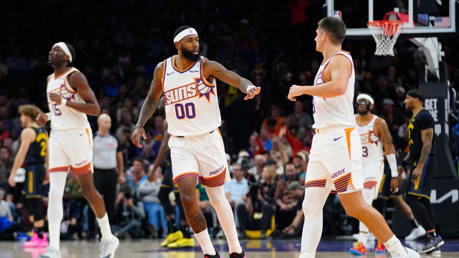
5. Phoenix Suns
Year released: 2013
The Suns have shaken the Western Conference as of late. Like some of the teams in this list, the Suns have maintained the same image in almost all of their logo versions. For the Suns, only its first one had stark differences.
What’s your favorite Suns logo to rep? pic.twitter.com/hJLBjnRY1t
— Phoenix Suns (@Suns) May 27, 2020
Throughout the years, the Suns have unveiled a consistent image, which is a basketball that has sun rays in an upward direction to the right. This current version is no different. The only difference with the current version is its color scheme that veered away from its traditionally retro-style. The 2013 logo displays more solid colors that make the logo stand out more.
4. Toronto Raptors
Year released: 2020
The Raptors had one of the most iconic logos back in 1995, with an image of a dinosaur playing basketball. Today, the current logo doesn’t sport a dinosaur. However, it’s still one of the best logos.
This Just In! The Toronto #Raptors will be getting new uniforms and tweaking their logo for the 2020-21 season multiple sources have confirmed to SportsLogosNet #NBA
Details here: https://t.co/eQkllKWxcP pic.twitter.com/1sKvLzC2PQ
— SportsLogos.Net (@sportslogosnet) June 15, 2020
Although there’s no dinosaur present, a basketball with dinosaur claw marks is a nod to the franchise’s branding. Furthermore, it certainly bolds well for them to use claw marks. It’s worth noting that Kawhi Leonard, who goes by the monicker The Klaw, actually led the Raptors to its first NBA championship.
3. Denver Nuggets
Year released: 2018
The current Nuggets logo is surely different from its previous versions. However, it does still maintain its roots. The two pick axes were a callback to the first logo the Nuggets sported in 1974. Furthermore, the current logo also maintained the classic mountain image. Overall, these images symbolizes the mining industry and mountainous landscape of Denver, Colorado.
A new logo, new uniforms and new team colors are out for the Denver @nuggets! What do you think of the change, Denver? #NBAFinals #GSWvsCLE pic.twitter.com/CiO3CMFDd8
— Denver7 News (@DenverChannel) June 7, 2018
The placement of these classic images are next to perfect. Moreover, the mix of colors suits the team very well. Because of this, they are in the Top Three of this list.
2. Atlanta Hawks
Year released: 2020
Atlanta is one of the young and upcoming teams in the East today. And their latest logo somehow represents this hungry Hawks team today. Although the previous Hawks logo was more explicit with an animated version of the Hawks, their current logo brings back the 1972 edition.
The new Atlanta Hawks *primary logo* has been leaked… Surprise! It's in a roundel.
Details: https://t.co/PZqFP8A2MQ pic.twitter.com/4Mo7R8LUV7
— SportsLogos.Net (@sportslogosnet) May 31, 2015
Like the one they displayed in 1972, this logo has a sleek and minimalist design. However, the silhouette of the head of the Hawk is more detailed. But more importantly, the fierceness of the Hawks’ facial expression is taken to another level. This certainly added more flare to their logo, despite it being such a simplistic design.
1. Chicago Bulls
Year released: 1966
Throughout history, the Bulls have never showcased more than one logo. Given the logo artwork’s brilliance and the franchise’s decorated history, there’s simply no reason to change it. Because of this, it’s arguably the best logo in the NBA.
The Bulls logo is easily recognizable, given that the logo’s centerpiece is a fierce-looking bull. The intricate details such as the wrinkles and eyes make it look more intimidating which is fit for a franchise that accomplished two three-peats. Furthermore, the mix of colors is just next to flawless. Given that the logo gives justice to a decorated franchise like the Bulls, there’s no wondering why it’s one of the most iconic logos in sports.