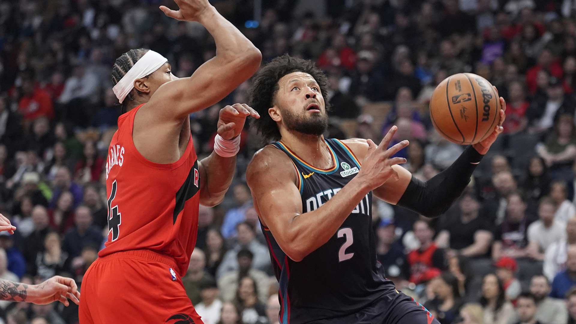
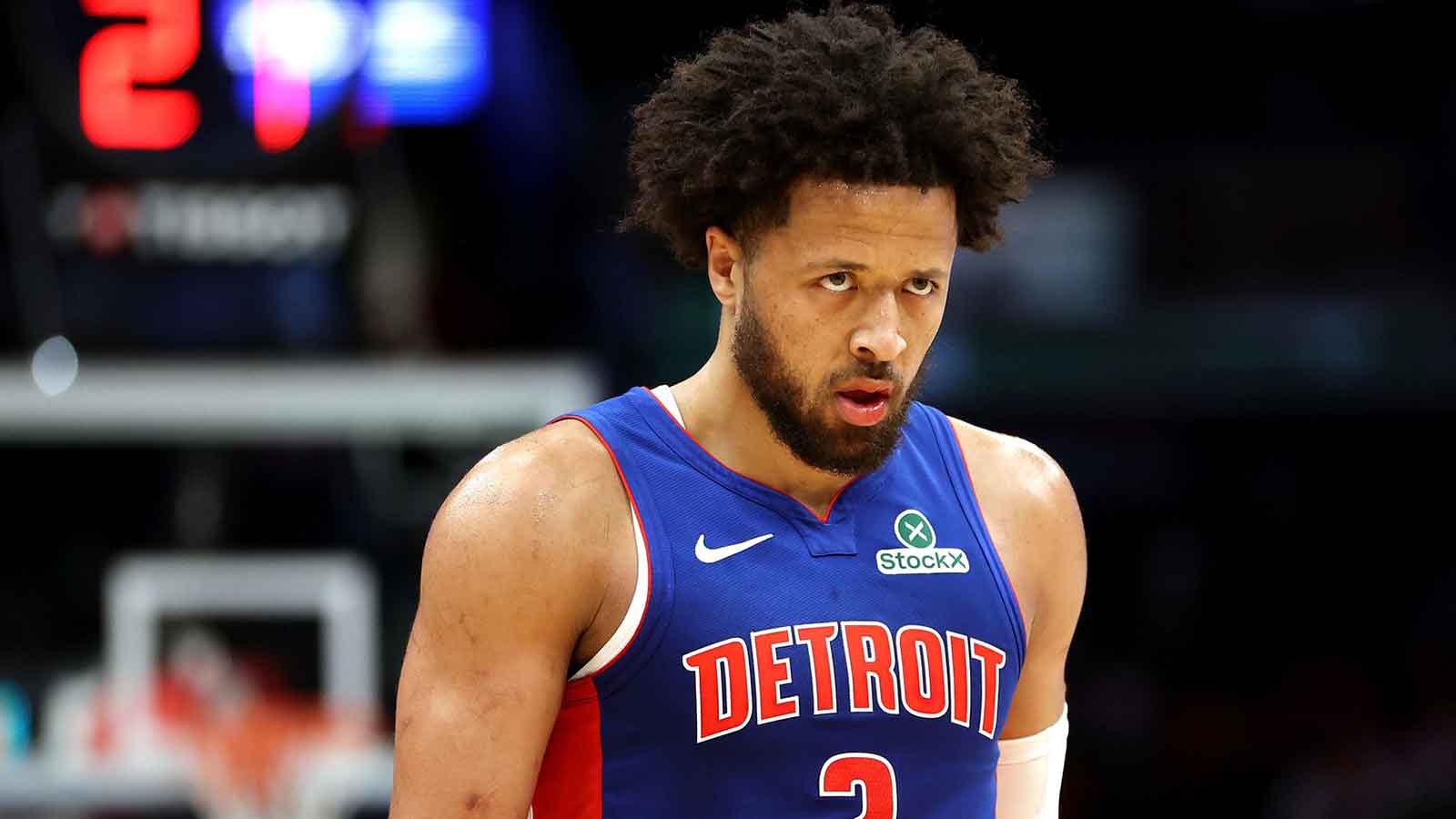
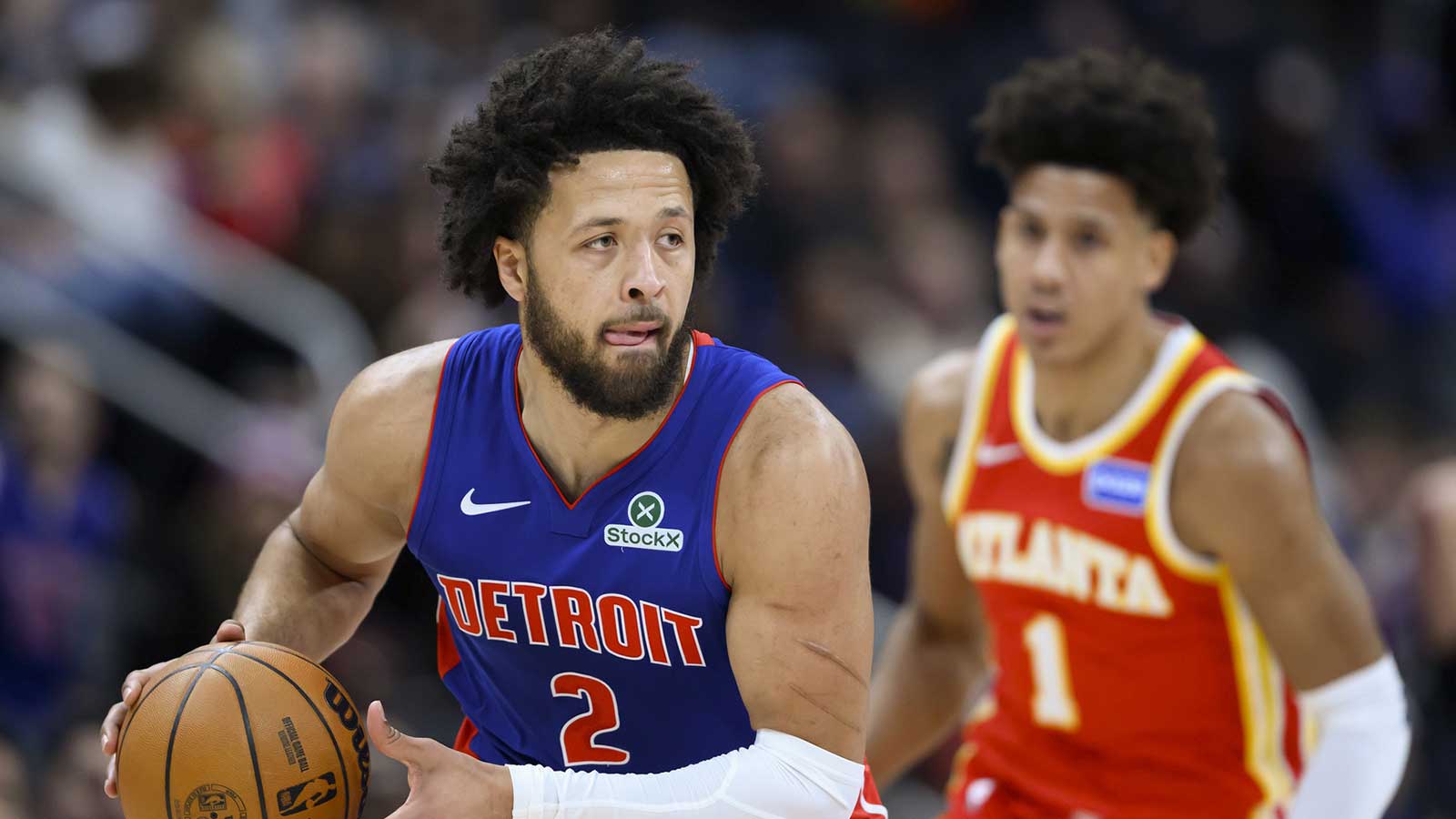
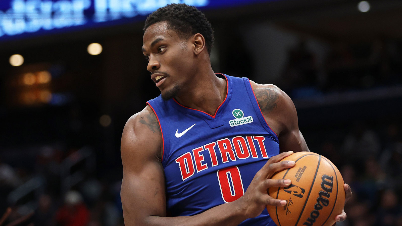
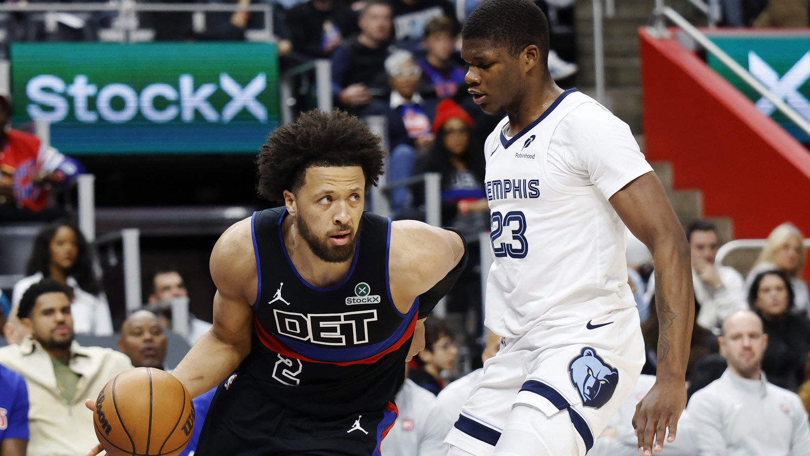
The NBA is unveiling their City Edition jerseys and the Detroit Pistons' jerseys are inspired by the automotive industry. This makes perfect sense considering Detroit's place as the Motor City. Detroit is synonymous with brands like Chevy and GM and even their nickname, the Pistons, fits the Motor City theme.
#MotorCity pic.twitter.com/iibAhHO7Ft
— Detroit Pistons (@DetroitPistons) November 1, 2018
But there's one problem with these jerseys: they're incredibly bland. There isn't much in terms of color scheme or design that makes you want to buy this jersey. The black on gray colors are boring and the two stripe design is unimaginative. The Motor City moniker on the front is a nice touch, but it doesn't make up for the rest of the deficiencies.
It's far too simple and the basic look is forgettable. Simplicity isn't a bad thing, but Detroit's City Edition jersey fails to pull it off the same way that others do. Boston kept almost the same design as their regular jerseys, but the gold trim does just enough to give it a sleek look. Additionally, the Brooklyn Nets could have the most interesting and inspired design with their Biggie Smalls inspired look. Their City Edition jerseys are largely the same as their regulars but have a Coogi-style color scheme on the sleeves and the neckline.
The Pistons jerseys aren't terrible by any stretch. But they aren't the type that will excite fans quite like some of the other designs around the league. The design was looking to capitalize on simplicity, but it misses the mark.


