After months of speculation, rumors and leaks, the NHL and Adidas finally unveiled the new set of Reverse Retro jerseys for all 32 teams on Thursday. The previous set of these jerseys, worn during the COVID-shortened 2020-21 season, contained some incredible designs, and this batch follows suit.
For the uninitiated, a Reverse Retro jersey takes a previous jersey in the team's history and remixes it in some way. That can be either swapping colors around on the jersey itself, or by applying modern colors to an old jersey. This time around, though, some teams stretched the definition to broaden their possibilities.
Let's rank all the 2022 NFL Reverse Retro jerseys from worst to first.
32. Detroit Red Wings
🤩 #reverseretro⁰⁰Get yours 11.15⁰⁰#LGRW x @adidashockey pic.twitter.com/87kRDN3c2l
— Detroit Red Wings (@DetroitRedWings) October 20, 2022
As an Original Six franchise, Detroit is very traditional when it comes to aesthetics. The winged wheel adorning a red and white jersey is one of the most iconic looks in all of sports, and it has received only minimal changes since the team became the Red Wings in 1932.
Their Reverse Retro jersey definitely breaks the mold, but not in a good way.
This jersey takes inspiration from Detroit's 1991-92 75th anniversary jersey, which itself took inspiration from the club's 1927-28 look, when they were the Detroit Cougars. That's all well and good, but the decision to incorporate black into the uniform is baffling. The Red Wings have never worn black in their storied history, and it almost makes them look like a different team entirely.
31. Chicago Blackhawks
The 2022-23 Blackhawks reverse retro jerseys have arrived. Thoughts? pic.twitter.com/LaJHO26qxW
— Barstool Chicago (@barstoolchicago) October 20, 2022
Detroit and Chicago's design teams may have been working a bit too closely together when coming up with these threads. These two jerseys look way too similar, and it would be hard to tell the difference if not for the text adorning the front. However, the Blackhawks edge out their old rival because at least this actually looks like a jersey they would wear.
Chicago's Reverse Retro takes inspiration from the club's 1938-39 jersey, but with the red and black swapped and the “CHICAGO” text replacing the team's iconic crest. To be fair, the Blackhawks do deserve some credit for going so far back in their history. However, this is just another example of why these “barber-pole” style jerseys died out.
30. Columbus Blue Jackets
The old with the new. Remixed for 2022.#reverseretro
Get yours 11.15#CBJ x @adidashockey pic.twitter.com/bUOKkkkDzO
— Columbus Blue Jackets (@BlueJacketsNHL) October 20, 2022
For a team called the Blue Jackets, Columbus sure seems set on not wearing blue in their Reverse Retros. Last time, the Blue Jackets wore a primarily red jersey that looked a bit too close to the division-rival Washington Capitals. Now, they remixed their first-ever alternate jersey to make black the primary color, but that's not the main issue with this jersey.
The main issue is the shade of blue as the accent color. This shade does appear on Columbus' third jersey, but considering the original jersey used a navy base, it just looks out of place here. Perhaps the navy would have been too close to the black, but at least it would have been more in line with the team's identity.
29. Ottawa Senators
#reverseretro
Commande le tien 11.15#GoSensGo x @adidashockey pic.twitter.com/LTHUJtmCDk— Ottawa Senators (@Senators) October 20, 2022
Like Columbus, Ottawa chose to throw it back to its first-ever alternate uniform, which debuted in 1997-98. That jersey featured a red base with a white “swoosh” across the front, as well as the debut of the 3D-styled Senators logo. It wasn't the prettiest jersey by any means, but no one could deny it had personality.
With this revival, Ottawa stripped all of that personality away. The Senators gave the jersey a black base, made the “swoosh” black, and put their current logo on the front, resulting in a jersey that looks way too similar to their current home look. The original jersey became iconic during Ottawa's run to the Stanley Cup Final in 2007, and to see it stripped of its defining characteristics is a bit sad.
28. Seattle Kraken
🔄🦑
Pre-order your #reverseretro online today starting at 9am PT. Available in store on 11.15#SeaKraken x @adidashockey pic.twitter.com/KTxpfhCstq
— Seattle Kraken (@SeattleKraken) October 20, 2022
As the NHL's newest team, the Kraken don't have the luxury of drawing from a long, distinguished history. Instead, Seattle payed homage to a previous hockey team in the area, the Seattle Ironmen. The Ironmen debuted in the Northwest Industrial Hockey League in 1943-44, then joined the Pacific Coast Hockey League until 1952.
This jersey has some nice history behind it, but it isn't the most attractive on the block. With the same primary logo and heavy use of navy, this feels a bit too close to Seattle's regular home look. If they had gone all-in on the teal and used their shoulder patch logo, which combines the Seattle Space Needle and an anchor, this jersey would stand out a lot more.
27. Philadelphia Flyers
⚪️🟠⚫️#ReverseRetro
Get yours 11.15.#FueledByPhilly x @adidashockey pic.twitter.com/yeJXE1VeAW— Philadelphia Flyers (@NHLFlyers) October 20, 2022
Philadelphia is another team that hasn't had many uniform changes in its history. This jersey specifically pays homage to ones the Flyers wore throughout much of the '70s, including their cup-winning seasons in 1974 and 1975. The main difference is the black and orange swapping places, which doesn't make this jersey stand out much.
However, the most unique aspect of this look isn't the jersey itself, but rather the accompanying pants. The Flyers will don their long “Cooperall” pants, which they wore in the early '80s, during warmups when they wear their Reverse Retro threads. It's a great detail, but because it won't appear in games, it's not enough to boost Philly any higher.
26. Toronto Maple Leafs
2022 ⏪ 1962#reverseretro Get yours 11.15#LeafsForever x @adidashockey pic.twitter.com/sxoQZx5ObI
— Toronto Maple Leafs (@MapleLeafs) October 20, 2022
Toronto had one of the biggest duds in the first set of Reverse Retros. The blue and gray jersey that combined different eras of Leafs history just did not land well with fans. They took a more traditional route this time, and the result is a much better look.
This jersey takes Toronto's 1962 white jersey and simply flips the blue and white. It's a nice, simple, classic look, and the old-school Leafs logo is nice to see. However, this does look very similar to other Toronto jerseys, so it still sits relatively low on the list.
25. Carolina Hurricanes
2019 ➡️ 2022 😅 #ReverseRetro
Get yours 11.15#LetsGoCanes x @adidashockey pic.twitter.com/pgwJXJ0vBG
— Carolina Hurricanes (@Canes) October 20, 2022
Carolina definitely missed the “retro” part of Reverse Retro with this jersey. This look is a “throwback” to their current road jersey, which debuted in 2019. The warning flags on the striping reference the Hurricanes' original look, but that's as retro as this jersey is going to get.
With that said, this jersey works much better in red than it does in white. The colors pop much more on this version, largely due to the black striping. It's a solid jersey, but the fact that it misses half the point of the series lands it this far down the rankings.
24. St. Louis Blues
1966 meets 2022 💛
Get your #ReverseRetro 11.15 or order presale today at 11 a.m.#stlblues x @adidashockey pic.twitter.com/2sL4is8coM
— St. Louis Blues (@StLouisBlues) October 20, 2022
Much like Columbus, St. Louis seems determined to not wear blue jerseys in the Reverse Retro series. The previous jersey featured a red base, and this offering features a gold one. However, the Blues had a unique inspiration for this jersey.
The original version, which featured a white base, was actually a prototype from 1966, and St. Louis never wore it on the ice. Seeing this design on an official jersey after more than 50 years is simply fantastic. It may not be the most attractive jersey, but as a one-off specialty, it works very well.
23. Vancouver Canucks
Inspired by 1962 Johnny Canuck, this year's #ReverseRetro is a remix of history.
Pre-order now on https://t.co/LrfISljkcT pic.twitter.com/AsVU3PJlL4
— Vancouver Canucks (@Canucks) October 20, 2022
The Canucks took inspiration from a jersey not of their own history, but from the Western Hockey League team of the same name. Vancouver's jersey features the classic Johnny Canuck logo on a navy base with green and beige accents. Even the numbers on the chest are a nod to the WHL team's 1962 jerseys.
This is a nice jersey with a very classic feel to it. It looks a little out of place next to modern jerseys, but that's just part of the charm.
22. Buffalo Sabres
The #ReverseRetro jersey will be available November 15!#LetsGoBuffalo x @adidashockey pic.twitter.com/vZFJOdfvHK
— Buffalo Sabres (@BuffaloSabres) October 20, 2022
The Sabres already brought back their 1996 black jersey as an alternate this season, and now they're double dipping. This Reverse Retro features the same base design, but replaces the black and red with the traditional white, royal blue and gold. The Sabres took a very similar route last time around, remixing their alternate jersey from that era with modern colors.
This is a nice jersey, but feels a bit overshadowed next to the jersey it's based on. A royal blue base instead of white would have helped this one stand out a lot more by comparison.
21. New Jersey Devils
In '82 the Rockies relocated to Jersey and became the #NJDevils.
Our 2022 @adidashockey #ReverseRetro uniform pays homage to that history.
📰: https://t.co/Z2miy7I9di pic.twitter.com/A6hXgior73
— New Jersey Devils (@NJDevils) October 20, 2022
The Devils reached far back in their history for this jersey, even beyond their New Jersey days. The design matches their inaugural 1982 jersey, but the color scheme comes from their two previous incarnations, the Kansas City Scouts and Colorado Rockies (not the baseball team).
New Jersey took a very interesting route for this jersey, and it resulted in a nice overall look. However, another team did a similar concept better.
20. Colorado Avalanche
Our love of home, and love of hockey. #ReverseRetro
Preorder today, jerseys ship November 15. #GoAvsGo x @adidashockey pic.twitter.com/FwRR32YxRc
— x – Colorado Avalanche (@Avalanche) October 20, 2022
The Avalanche took their inaugural 1995 jersey, and spiced it up with elements of the Colorado state flag, including the colors and primary logo. Considering the Rockies used a very similar logo and color set, this also doubles as a reference to the state's hockey history. The Devils may have claim to the Rockies' history, but these colors suit the Avalanche better given the history behind them.
19. Nashville Predators
Throwing it back to 2001 ⏪
Get your #ReverseRetro 11.15#Preds x @adidashockey pic.twitter.com/HXmiIj9gMg
— Nashville Predators (@PredsNHL) October 20, 2022
Nashville kicks off a streak of jerseys that are objectively ugly, but such a fun callback that it's hard to dislike them. In this case, the Predators revived their infamous mustard third jersey from 2001, now featuring the modern gold. It's a much better look than the original, and fits nicely into Nashville's current brand.
Similar to the Sabres, though, this jersey could be much better with a color change. A navy base would do wonders for this jersey, and would help it stand out from their gold home jersey. A decent look with a fun callback, but it still feels like a missed opportunity.
18. Boston Bruins
(Pooh) Bear necessities. #reverseretro
Get yours 11.15#NHLBruins x @adidashockey pic.twitter.com/stgQ4QyUUp
— Boston Bruins (@NHLBruins) October 20, 2022
Boston chose to bring back its first ever third jersey, and one of the first in league history, from 1995. The gold jersey, which fans affectionately call the “Pooh Bear” jersey, stuck around for 11 years and became a cult classic among Bruins fans. Now it's back in white, looking better than ever.
The original jersey is up there as the most “'90s” jersey ever, and the Bruins maintained that with this revision. It's still a ridiculous looking jersey, but it's so much fun that one can't help but smile.
17. Tampa Bay Lightning
Vibe check. What do y'all think? 👀
Get yours mid-November. #GoBolts x @adidashockey pic.twitter.com/Uph7c8P3Vr
— Tampa Bay Lightning (@TBLightning) October 20, 2022
Another jersey that screams “'90s,” Tampa Bay's 1997 “storm” jersey makes its grand return in 2022. The original jersey, which featured a blue base, lasted for three seasons before the Lightning phased it out.
Tampa Bay kept all of the wacky '90s charm in this new take on the infamous jersey, which is definitely a plus. The rain droplets, waves and lightning bolts come together to form an insane jersey, and the new white base helps it pop much more.
16. New York Islanders
On ice debut 🔜 #reverseretro
Cop yours 11.15 or preorder now: https://t.co/ur0lMayHt7 pic.twitter.com/uiMpc9FefK
— New York Islanders (@NYIslanders) October 21, 2022
The Bruins and Lightning provide stiff competition, but the Islanders' “fisherman” jersey may just be the definitive “'90s” jersey. The original 1995 jersey is simply bizarre, featuring teal accents and a wavy design that extends to the numbers and nameplate. While initially hated so much that New York retired it after one season, this jersey has gained popularity in recent years, with some fans clamoring for its return.
Those fans got their wish, but unfortunately, some of the personality got lost in the transition. The teal accents are now hardly noticeable, and the wave designs are gone almost entirely. Still, it's great to see the Islanders bring this cult classic back, especially after their previous Reverse Retro was nearly identical to their regular jerseys.
15. Minnesota Wild
Clean in green. #ReverseRetro
Get yours 11/16 | #mnwild x @adidashockey pic.twitter.com/9fy5YeurQd
— Minnesota Wild (@mnwild) October 20, 2022
With the wacky throwback streak out of the way, Minnesota kicks off a streak of teams who did nearly the same thing as the last Reverse Retro set. The Wild once again paid tribute to the Minnesota North Stars, who moved to Dallas in 1993. The only difference is that this jersey features a green base, while the previous one was mostly white.
That said, the reason Minnesota decided to double-dip is because it's such a good luck. This one is even better, with the darker colors standing out a lot more. However, the lack of creativity knocks the Wild down a few spots.
14. New York Rangers
Iconic. Perfection. 😍
Available for preorder at 12 PM today on https://t.co/wT6lc1Qyxb or at the MSG Team Store on Nov. 15. #NYR x @adidashockey. https://t.co/GyKRmyJvtU pic.twitter.com/nVlqCrqAo2
— x – New York Rangers (@NYRangers) October 20, 2022
The Rangers opted to bring back their iconic “Lady Liberty” jerseys for another go around. This time, though, they swapped out the navy for their more traditional royal blue. This one also maintains the red sleeves, which the previous version replaced with more navy.
This jersey is a clear step up from the previous one, which was already great. New York actually reversed the jersey this time, and it led to another great look. It would have been nice to see the crest itself feature the royal blue, but that's just a nitpick.
13. Arizona Coyotes
Bringing the heat. 🔥
Get yours 11.15#Yotes x @adidashockey pic.twitter.com/o2IpCe2CQC
— Arizona Coyotes (@ArizonaCoyotes) October 20, 2022
Arizona is another team to double-dip for its Reverse Retro, bringing back the 1998 alternate jersey once again. Rather than a green or purple base, the Coyotes used a burnt orange color to go along with red accents. This marks the first NHL jersey to use this color as a base, and it feels right at home in the desert.
12. Dallas Stars
1993 meets 2022.#reverseretro
Get yours 11.15#DallasStars x @adidashockey pic.twitter.com/eR7n2fLdCT
— z – Dallas Stars (@DallasStars) October 20, 2022
Like last time, Dallas brought back a '90s jersey and updated it with modern colors. Unlike last time, the Stars did it right with this jersey.
This jersey specifically pays homage to the inaugural 1993 look. Swap the gold for silver, make the green brighter and move the colors around a bit, and ta-da. The result is a very clean look that may be the best in Dallas' current rotation.
11. Montreal Canadiens
À venir très bientôt #ReverseRetro
Procurez-vous le vôtre le 15 nov. ou précommandez-le dès maintenantOn-ice debut 🔜 #ReverseRetro
Cop yours 11.15 or preorder now#GoHabsGo x @adidashockey pic.twitter.com/Xkicm5DyK5— Canadiens Montréal (@CanadiensMTL) October 21, 2022
This might be the most unique jersey in Canadiens history as this is the first time they've ever worn light blue. Unlike Detroit, though, Montreal has a very good reason to introduce an entirely new color.
The NHL claims that the light blue comes from “the city of Montreal's colors,” but everyone knows the real reason. The light blue is a throwback to baseball's Montreal Expos, who relocated and became the Washington Nationals in 2005. For paying tribute to another Montreal team in such a classy way, the Habs get a big boost on this list.
10. Anaheim Ducks
Our Mighty past meets the future#reverseretro Get yours 11.15 #FlyTogether x @adidashockey
MORE INFO: https://t.co/w8jH9QXJWt pic.twitter.com/J4Yp4RhOE5
— Anaheim Ducks (@AnaheimDucks) October 20, 2022
Like many other teams, Anaheim brought back its inaugural jersey in its modern color scheme. However, the Ducks stand above the rest because that original jersey is one of the most iconic in sports history.
Granted, the removal of the jade and eggplant does take away some of the charm of the original Mighty Ducks jersey. Still, the design is timeless and holds up well in the new colors. Anaheim fans had been clamoring for this jersey to return for years, and they got their wish here.
9. Vegas Golden Knights
The GLOW up is real 😎
Our #reverseretro jersey is the first to incorporate glow-in-the-dark elements, paying homage to the neon lights of the Las Vegas Strip pic.twitter.com/GNjoWBI8Fg
— Vegas Golden Knights (@GoldenKnights) October 20, 2022
According to the NHL, Vegas' Reverse Retro is meant to represent “what a Golden Knights third jersey might have looked like in 1995.” The reasoning may be a stretch, but the Golden Knights deserve credit for making a great jersey out of nothing.
The diagonal “VEGAS” text works surprisingly well on this jersey, and the sword on the pants is a great added detail. However, what sets this jersey apart is that it will be the first NHL jersey ever to glow in the dark. It's such a cheesy detail that will never show up in an actual game, but it's so fitting of Vegas and certainly sets this jersey apart.
8. Calgary Flames
Back in black 🔥 #ReverseRetro
Get yours 11.15#Flames | @adidashockey pic.twitter.com/UUhHwYbTjJ
— Calgary Flames (@NHLFlames) October 20, 2022
Going back to the '90s, Calgary chose to bring back its 1995 “pedestal” jersey, now with a black base. The new color makes the red, yellow and white accents pop much more than on the original version, both red and white. This is another great look in the Flames' already fantastic jersey set.
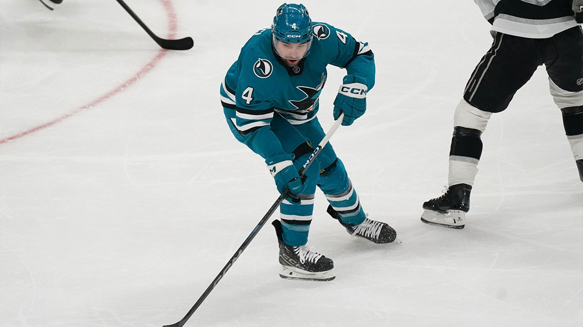
7. San Jose Sharks
You already know 🦭🦈
Here’s a closer look…
get yours 11.15.#ReverseRetro x #SJSharks x @adidashockey pic.twitter.com/kq8OGV4qAr— San Jose Sharks (@SanJoseSharks) October 20, 2022
The Sharks had plenty of past jerseys they could have revived, but they chose a different route instead. San Jose chose to pay tribute to the California Golden Seals, the Bay Area's original NHL team. This jersey specifically references the Seals' 1974 jerseys, which they wore until they moved to Cleveland in 1976.
The teal and gold perfectly complement the white base, and create a sharp-looking jersey. This one feels like it will be one of the more popular ones in the set, and rightfully so.
6. Washington Capitals
𝗘𝗘𝗘𝗘𝗘𝗘𝗘𝗘𝗔𝗚𝗟𝗘
Get your #ReverseRetro 11.15#ALLCAPS x @adidashockey pic.twitter.com/0GOyOPtPAj
— Washington Capitals (@Capitals) October 20, 2022
Washington is another team that decided to double-dip, bringing back the 1995 “Screaming Eagle” jersey back again. Last time, the Capitals overhauled this jersey with the modern red, white and blue color scheme. This time, they remixed original colors by making black the dominant color with a light blue accent.
The red one stands out more, but this is still a fantastic jersey. The logo is so good, and the little details throughout the jersey only enhance it. Washington should strongly consider making this design its main jersey once again.
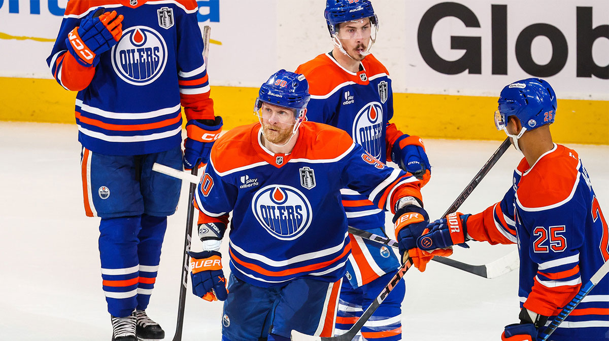
5. Edmonton Oilers
Introducing our @adidas #ReverseRetro 2022.
Available 11.15#LetsGoOilers x @adidashockey pic.twitter.com/x0SS0TGYld
— Edmonton Oilers (@EdmontonOilers) October 20, 2022
Edmonton opted to bring back its 2001 alternate jersey for this set of Reverse Retros. The original jersey was a bit on the plain side, with a navy blue base and small gray and white accents. With some small changes, though, this jersey has become one of the best in the series.
Most of the gray accents on the original jersey have become a vibrant orange in this revision. This not only makes the jersey pop much more, but makes it feel much more in line with the Oilers' brand. This should absolutely become the team's new third jersey, as it's too good to only be around for one year.
4. Winnipeg Jets
Whiteout /// Rebooted#reverseretro Get yours 11.15#GoJetsGo x @adidashockey pic.twitter.com/2gjc86LRIW
— Winnipeg Jets (@NHLJets) October 20, 2022
Like many times previously, the Jets paid tribute to the previous team won the same name, which became the Coyotes, and remixed the jersey with modern colors. This one stands out, though, as rather than going for the original 1979 design again, Winnipeg looked to the 1990 revision, which featured a new logo and striping.
The Jets gave this underrated jersey a white base, with accents of navy and light blue. The result is a great look that serves as a great reference to the whiteout Winnipeg pulls for big games.
3. Florida Panthers
CAN YOU EVEN BELIEVE
☀️🌴🏒 » https://t.co/1scA7KeX0m pic.twitter.com/KH4Cdwon1m
— Florida Panthers (@FlaPanthers) October 20, 2022
Florida's jersey is the most distinct of the entire set, as there isn't one solid origin for it. The base design matches the Panthers' 1998 jerseys, but the light blue base and shoulder patches come from the 2009 alternate. On top of that, this marks the first time the sun and palm tree logo appears as the main crest, as it is traditionally a shoulder patch.
Altogether, this jersey just screams “South Florida” loud and proud. It's a distinct look that no other NHL jersey comes close to replicating. This is another jersey that is too good to only last one year, and needs to stick around as a third.
2. Pittsburgh Penguins
1992 would be proud 🤩
Get your #reverseretro on 11.15.#LetsGoPens x @adidashockey pic.twitter.com/lvO3waW79R
— Pittsburgh Penguins (@penguins) October 20, 2022
After more than 20 years, the fan-dubbed “RoboPenguin” logo finally makes its grand return. This jersey is a black version of the logo's debut appearance in 1992, and this is easily the best one to feature it.
It feels like this jersey has been around forever and it's baffling it took so long to get it. This jersey simply has all the makings of an instant classic.
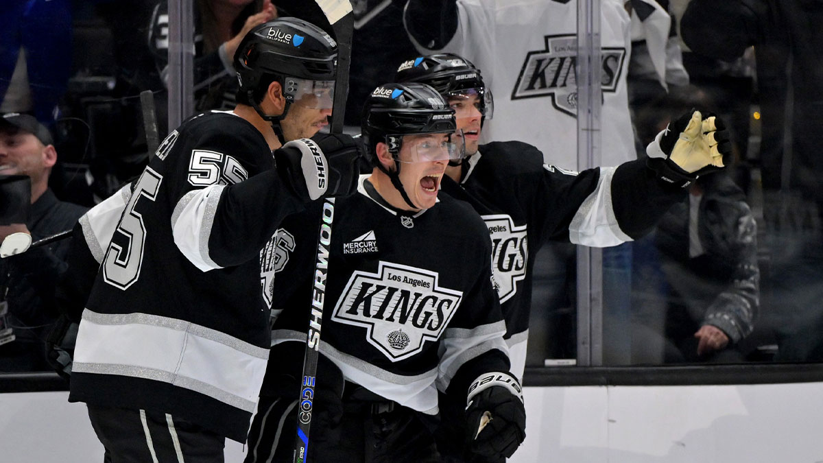
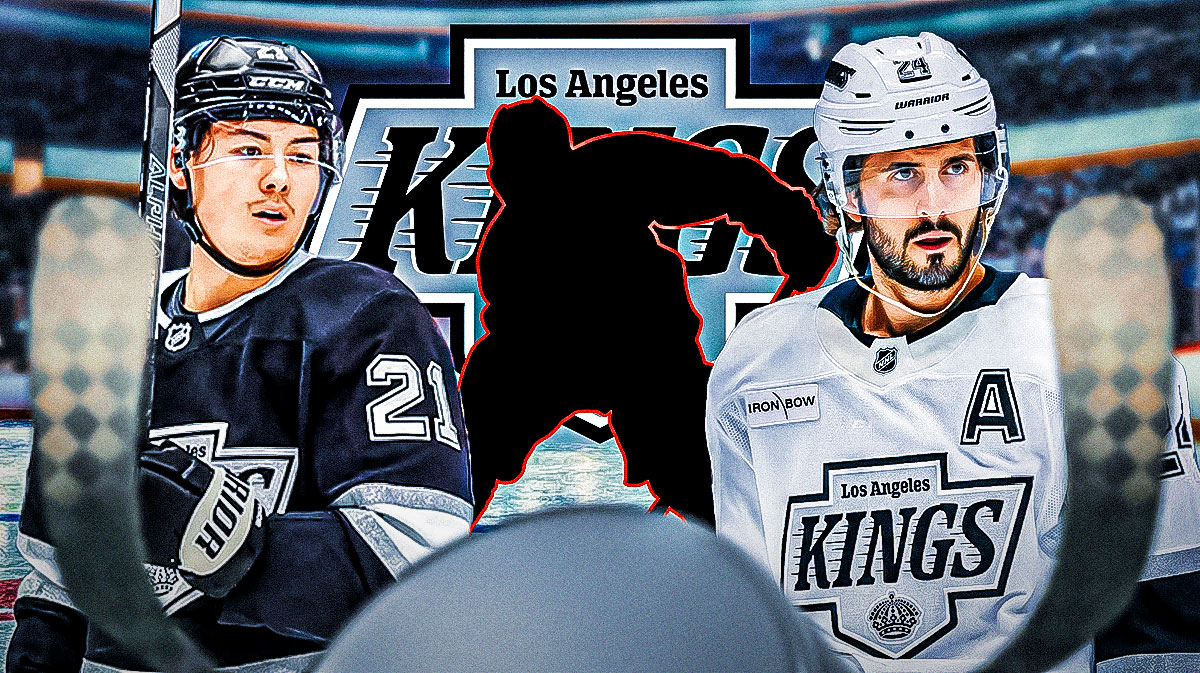
1. Los Angeles Kings
ROYALTY 👑#reverseretro
Get yours 11/15#GoKingsGo x @adidashockey pic.twitter.com/q64xzC0ud3
— LA Kings (@LAKings) October 20, 2022
Simply put, Los Angeles does not miss with its Reverse Retros. After delivering a beautiful purple jersey last time, the Kings threw it back to their purple and gold days once again this time. As expected, they knocked it out of the park once again.
This jersey takes inspiration from the one Los Angeles wore throughout much of the '80s, just with the white and gold swapped. This marks the first time this crown logo has appeared on a white jersey and it fits perfectly. If the Kings were to ever return to the Lakers colors, hockey fans everywhere would rejoice. For now, though, this jersey is the best in the series, and arguably the best in the league.