The Orlando Magic officially unveiled a new logo and three redesigned uniforms on Tuesday as part of a rebranding initiative ahead of the 2025-26 NBA season. With rising stars Paolo Banchero and Franz Wagner leading the way, the updates blend modern design with classic elements, reinforcing the franchise’s identity while honoring its roots.
In a press release, the Magic announced the return of a fan-favorite franchise symbol: the star. The redesigned primary logo reintroduces the iconic star motif, which now features a “new-look” cascading trail. The letter “A” in both “Orlando” and “Magic” has also been replaced with a star, giving the updated wordmark a nostalgic yet refreshed look. The team’s traditional color palette — Magic blue, Magic black and Magic silver — remains unchanged.
“The new logo fondly revisits the Magic’s history making an iconic and fan-favorite franchise symbol ‘the star’ once again,” the team said in its statement. “The logo evolves with a nod towards nostalgia featuring a legendary, star-centric logo displaying a ‘reach for the stars’ mentality to match the team’s championship ideals.”
How we feeling, Magic fans!? 🤯 pic.twitter.com/yEtK2ikSY7
— Orlando Magic HQ (@OMagicHQ) June 3, 2025
The secondary logo now shows a star behind a basketball in motion, intended to reflect the franchise’s forward momentum and continued growth since its founding in 1989.
Magic unveil throwback-inspired uniforms with bold pinstripes and star accents
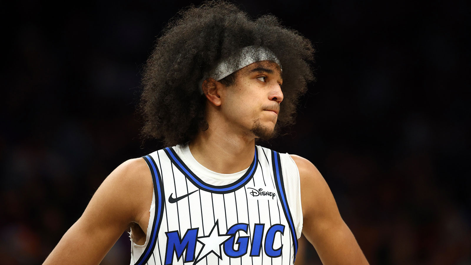
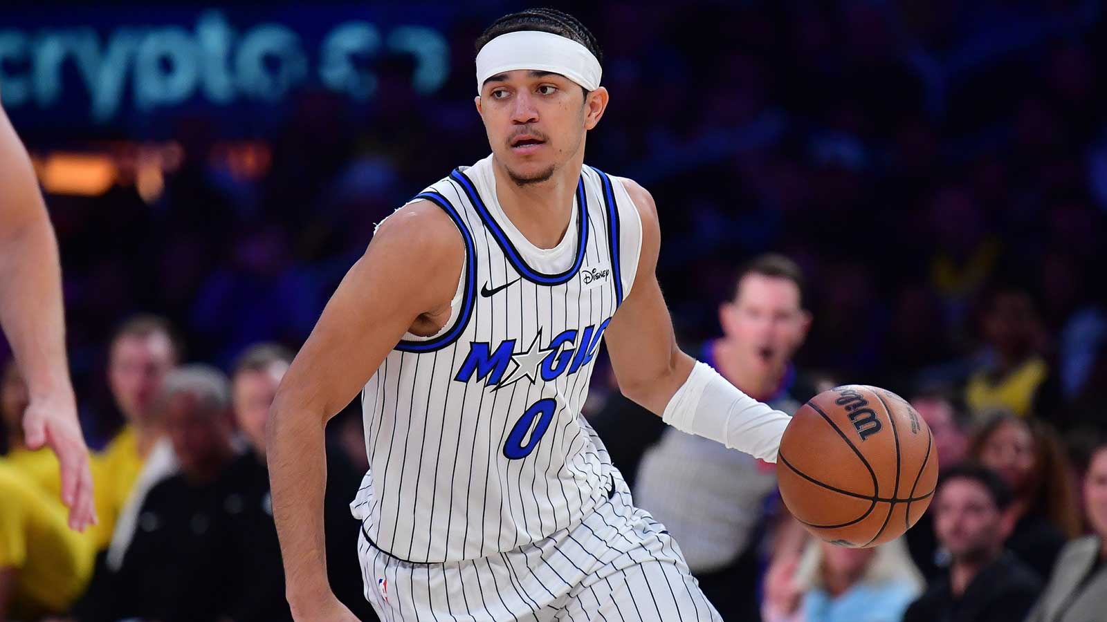
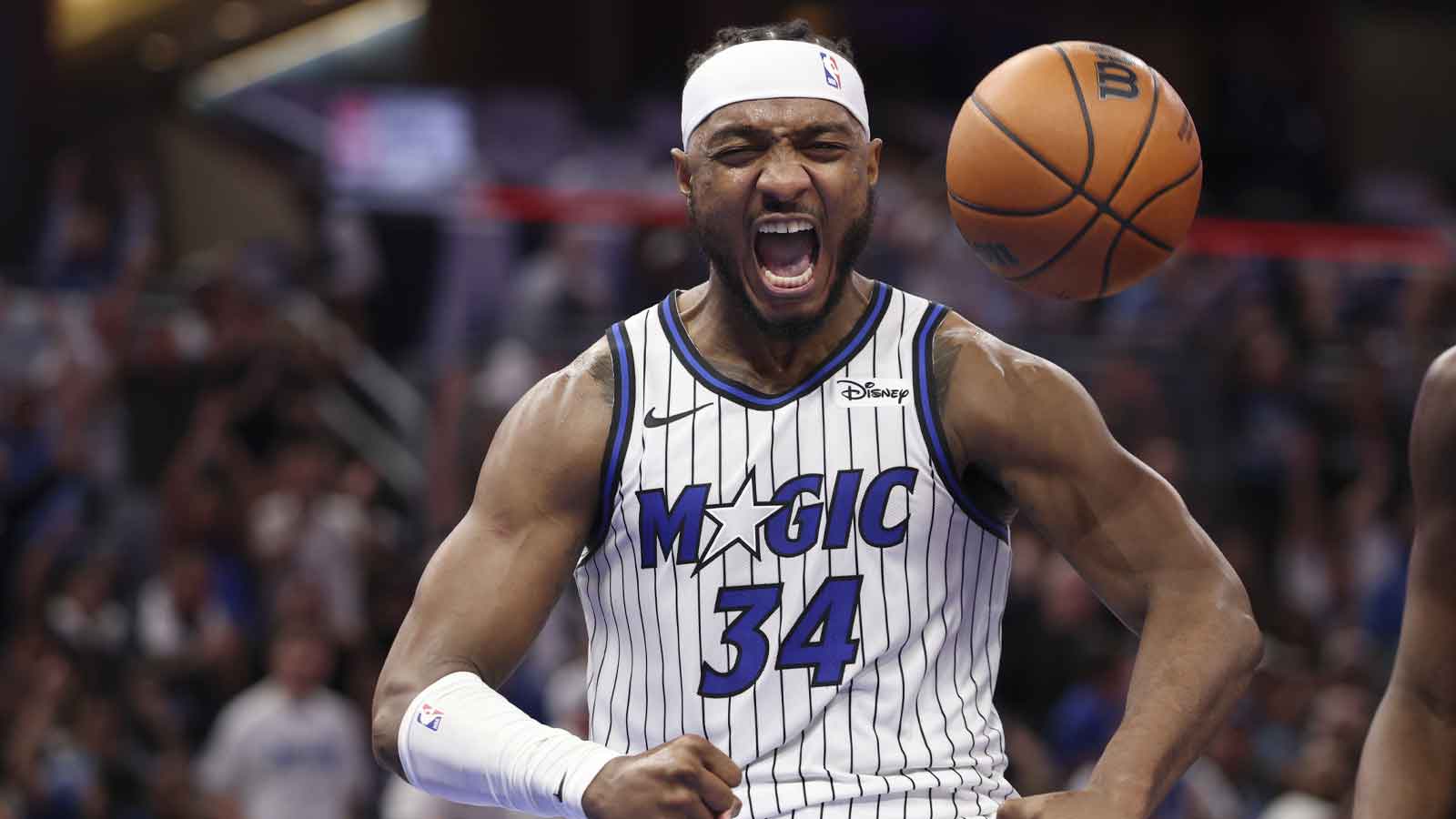
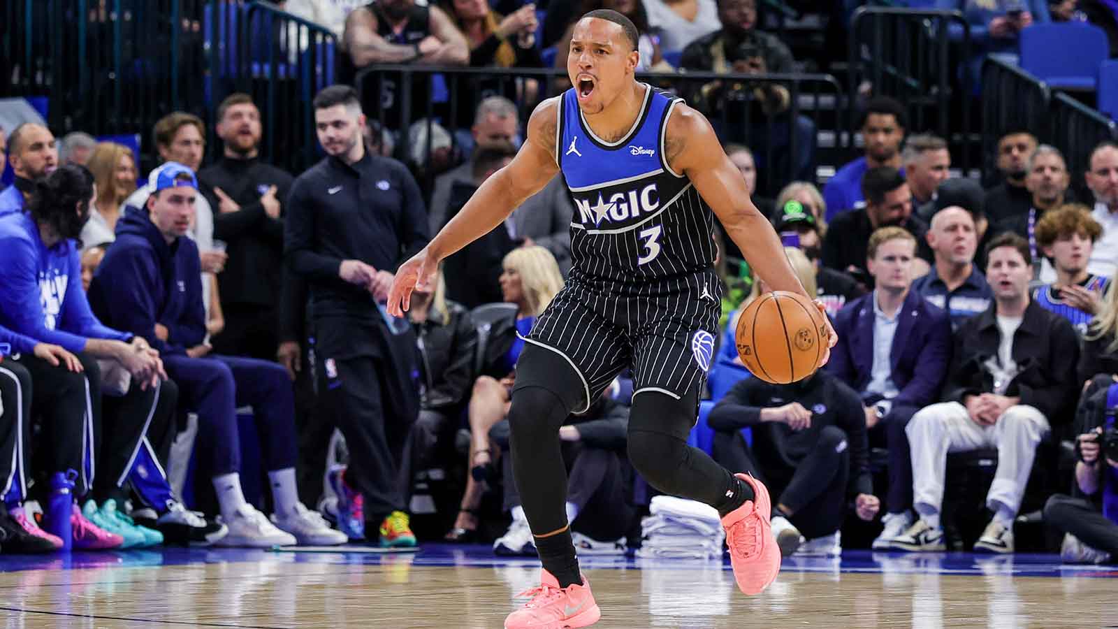
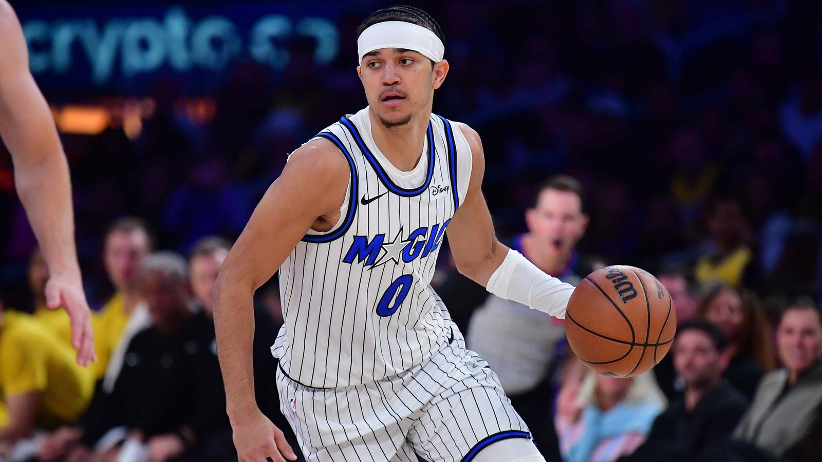
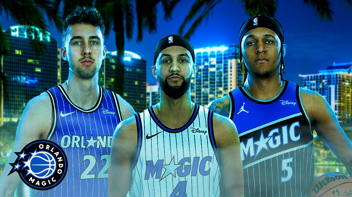
Alongside the updated branding, the team revealed three new uniforms for the upcoming season: the Association (white), Icon (blue) and Statement (black) editions. The uniforms are described as “modern classics” that pay homage to the team’s most iconic looks while ushering in a new era of Magic basketball.
“The three new uniforms… have evolved into modern classics, honoring the rich history of the Magic’s most iconic jerseys while ushering in a new era of Orlando Magic basketball,” the team said. “With the return of the bold pinstripes, the MAGIC and ORLANDO wordmarks, uniform trim and bold star on the shorts… the uniforms are a nostalgic tribute to a favorite of the Magic’s fanbase.”
a modern classic pic.twitter.com/Jokl3t5ujx
— Orlando Magic (@OrlandoMagic) June 3, 2025
The Statement edition stands out as the only Jordan Brand uniform in the lineup. It draws direct inspiration from the team’s original on-court warm-up jackets and includes bold pinstripes and the new star icon prominently featured on the shorts.
Magic rebrand reflects championship aspirations and fan-driven vision
Magic Executive Vice President of Marketing and Social Responsibility Shelly Wilkes emphasized the connection between the new designs and the franchise’s long-term goals.
“The Orlando Magic’s mission is to be world champions on and off the court,” Wilkes said. “The logo and uniforms are an extension of that mission and a direct reflection of the excellence our organization strives for from our ownership to our staff, coaches and players.”
Wilkes also noted the role of fan feedback in shaping the rebrand.
“Based on fan feedback, the new logo was a collaboration and really a labor of love… This logo and new uniforms signify the beginning of a new era of excellence for the Magic while paying homage to the past.”
The rebrand was celebrated during a special event at Kia Center on Tuesday and will continue with a fan showcase later in the day. As the Magic gear up for a pivotal offseason, the organization appears poised to shift into “win-now” mode. With Paolo Banchero and Franz Wagner anchoring a promising young core, Orlando holds the No. 16 pick in the 2025 NBA Draft, set for June 25–26 at Barclays Center in Brooklyn. The draft begins at 8:00 p.m. ET and will air on ABC and ESPN.