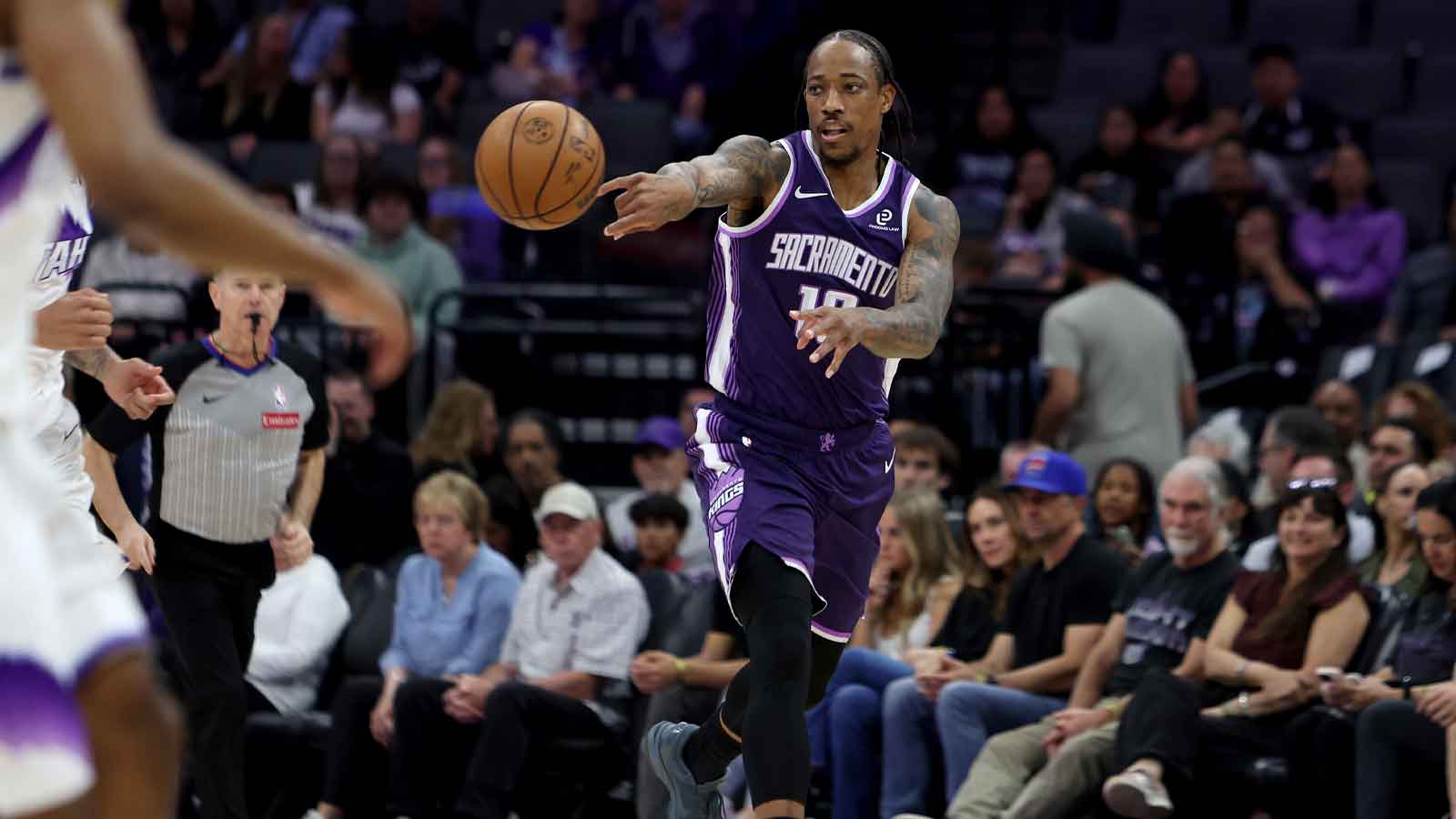
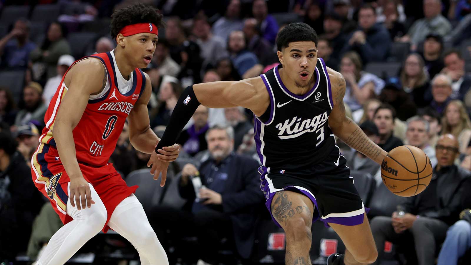
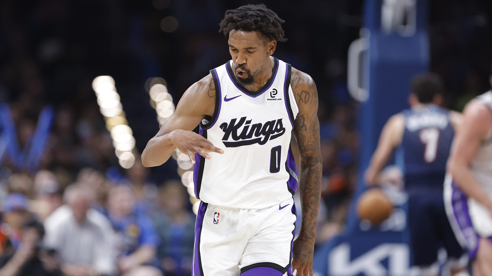
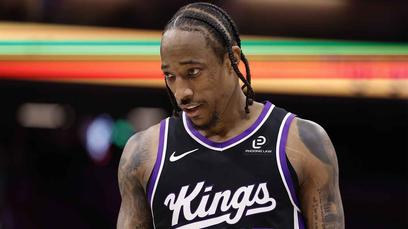
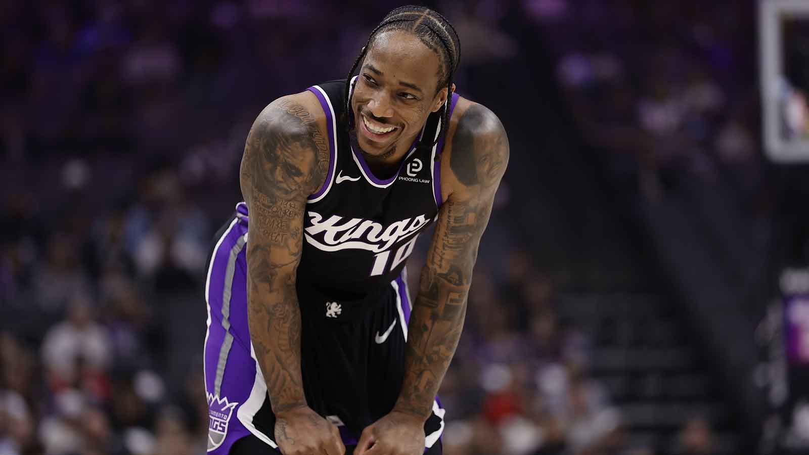
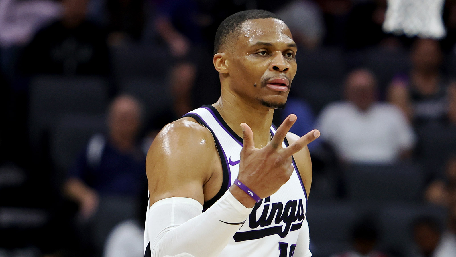
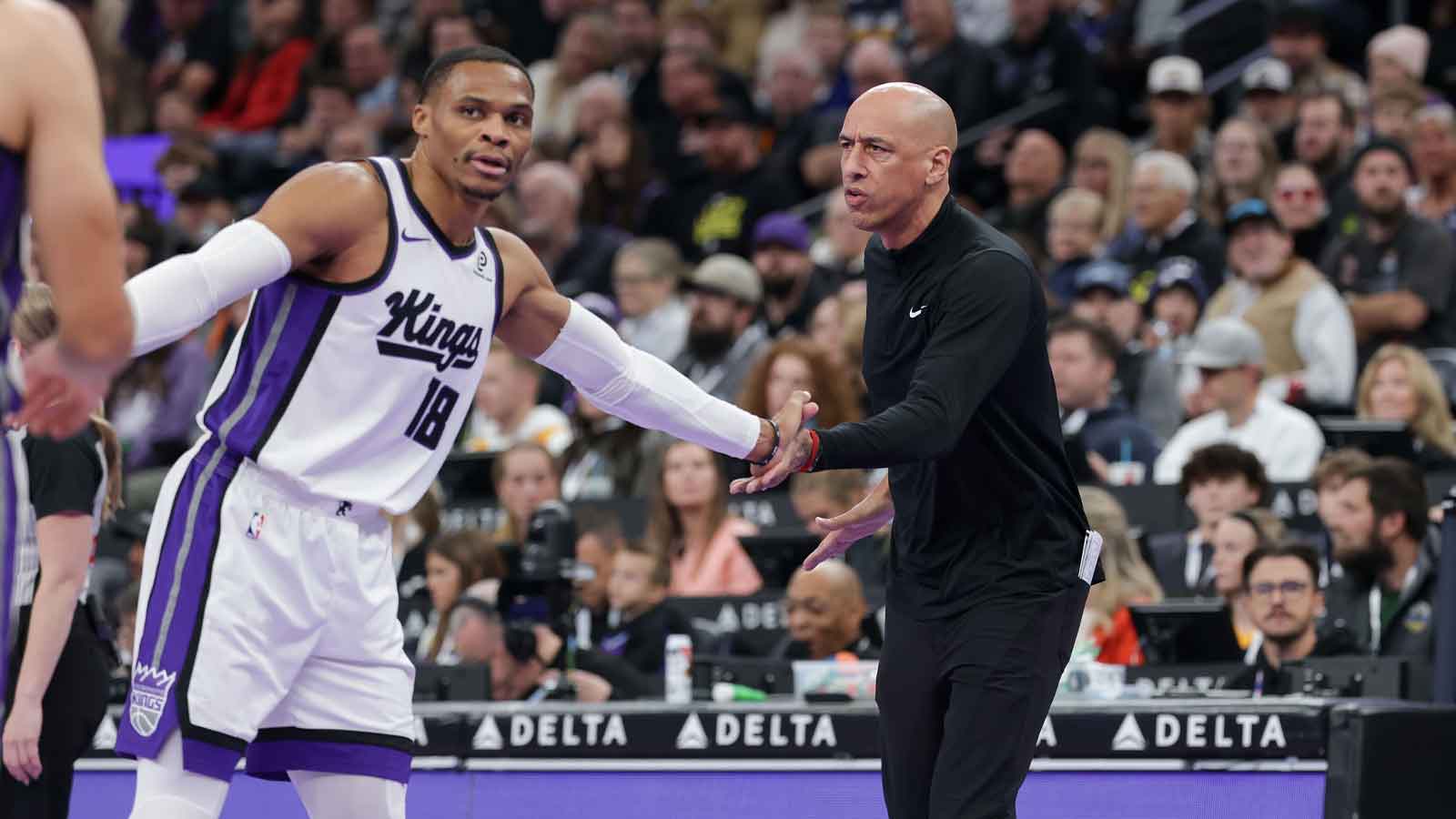
Despite their unfortunate regular season, the Sacramento Kings seem eager to hit the court for the 2016-17 season with a fresh new get-up. The team has ditched their old uniforms for a redesigned style, and they took quite the extravagant route in unveiling it to their fans.
Feel free to join Willie Cauley-Stein in a 360 degree showcase of the new jerseys. The city and away jerseys rock a nice purple, the home jersey comes in a crispy white, while the black jersey is their global uniform.
Their designers and media team members were also very proud to boast their new designs on their Twitter page. In the span of nine or so tweets, the Kings gave their followers key insights to the design of their jersey. Small intricacies like three baby blue stitches on the jersey representing the team's city, pride, and foundation show that the designers took time to integrate meaning into their uniforms.
If the Kings want to improve from their 33-49 tenth place finish in the Western Conference, they have at least addressed their wardrobe. They say dressing well can boost confidence, so this team will at least be dressed for success.
Hopefully the excitement and hype from this jersey unveil can carry over to the team's play on the court a few months down the road.
[button width=”full” button size=”bigger” color=”custom” align=”center” textcolor=”#ffffff” texthcolor=”#ffffff” bgcolor=”#8b0000″ link=”https://clutchpoints.com/rajon-rondo-weighs-in-on-sacramento-kings-drama-and-problems-this-past-season/”]NEXT: Rajon Rondo weighs in on Sacramento Kings’ drama and problems this past season[/button]


