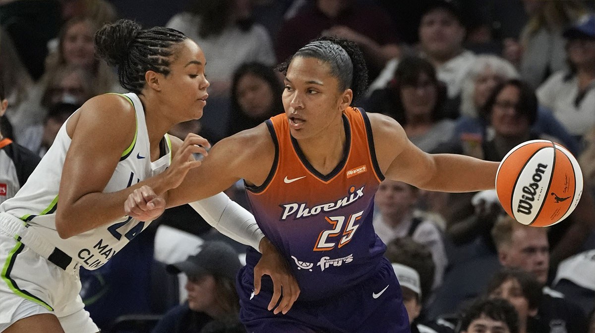
The Phoenix Mercury have revamped their brand for the upcoming 2026 season as they continue their pivot into the future. The organization revealed its new logo and word mark in the first major update to its look since its original debut in 1997.
Before this latest new look, the only change the Mercury had made to their brand had been adopting the purple and orange color scheme in 2011. The fresh appearance still has ties to the team's past, though, as it includes references to Phoenix's status as one of the founding franchises of the WNBA within its symbols.
NEWS: The Phoenix Mercury have announced a complete rebrand that includes an updated logo 👀
A new uniform is expected to be released on Tuesday. pic.twitter.com/vS0KoBQ8Xy
— The Athletic (@TheAthletic) November 24, 2025
“We wound up really being guided by this idea of wanting to modernize it instead of just come off the top rope out of left field with something different,” team president Vince Kozar explained to ESPN.
According to the Mercury's posts on X, formerly Twitter, the ring around the global logo is kept from the original mark, and the logo in the middle separates the internal rings into eight lines representing the eight inaugural teams in the W. The lines are also positioned at 19.97 degrees, symbolizing the league's and team's founding year of 1997.
— Phoenix Mercury (@PhoenixMercury) November 24, 2025
For the first time in their history, the Mercury have introduced a secondary logo. The outline is in the shape of the state of Arizona, symbolizing how support for the team extends beyond Phoenix to the entire state. Internally, it features the seams of a basketball, and the “Merc” moniker, a popular fan nickname for the team, is now part of its official branding. The logo comes in variations of purple, orange, black, and white.
Introducing the Secondary logo.
The first Secondary mark in franchise history. Swipe to experience the story. pic.twitter.com/lHP43EDdJe
— Phoenix Mercury (@PhoenixMercury) November 24, 2025
The “PHX” alternate logo represents the connection between the team and the fan community. The emphasized “X,” first introduced in 2021, evokes the name of the Mercury fanbase, the “X-Factor.”
Introducing the Alternate logo.
Debuting in 2021 as a nod to the X-Factor, the PHX mark embodies the connection between our team and the community. Swipe to see how this design creates identity. pic.twitter.com/bcvzAwxsUL
— Phoenix Mercury (@PhoenixMercury) November 24, 2025
The wordmarks written in the new “Mighty Mercury” typeface mimic the way the planet itself appears when it rises over a horizon. There's added symbolism in this, too — the eight-degree arc calls back to the W's original eight squads as well. The font is also said to “incorporate shadow knockouts and angles that match the aesthetic of each of the Mercury's new logos.”
Introducing the Wordmarks and Mighty Mercury type face.
You’ve seen the logos – now swipe to see the wordmarks and font that showcase the new era. pic.twitter.com/5F3xLJGarz
— Phoenix Mercury (@PhoenixMercury) November 24, 2025
The updated look is one of the ways the Mercury have tried evolving under team governor Mat Ishbia since franchise legend Diana Taurasi retired earlier in 2025.