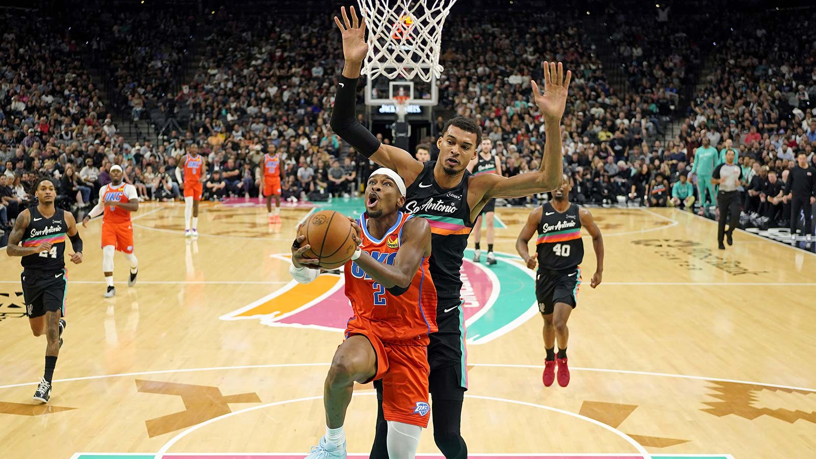
Last year was the inaugural season for the NBA implementing a tournament in the middle of the schedule. In 2023, that was called the In-Season Tournament, and each team had a unique court design for those games. Those courts were known for their vibrant colors, flashy themes, and most notably, the runway design that extended from baseline to baseline in the middle of the court.
That runway is gone, and it is being replaced with a center-court circle within a larger center-court circle. The NBA has officially unveiled all 30 unique court designs for what is now being coined the NBA Cup, and we are here to rank each one. These rankings take into account the eye-catching creativity and overall aesthetic of the new courts, as some are simply prettier than others.
NBA Cup court designs revealed. I caught up with Victor Solomon, the artist behind the looks, and Christopher Arena of the NBA to discuss this year's statement: A 30% opacity ‘wallpaper' giving each team an individualized perspective https://t.co/fDLsmYyUPy pic.twitter.com/NED62CuqpJ
— Tim Newcomb (@tdnewcomb) October 24, 2024
1. Minnesota Timberwolves
our official @NBA Cup Court 🐺 pic.twitter.com/0x6WM5B0Wf
— Minnesota Timberwolves (@Timberwolves) October 24, 2024
Everyone loved when the Minnesota Timberwolves would bust out the neon green jerseys, and now they have a court to match. The eye-popping color scheme isn't even the best part about the best NBA Cup court, though. The tree line is reminiscent of Timberwolves jerseys of old. Not only is the court nostalgic, in a way, but it has some of the best detail of any of the NBA Cup courts.
2. Toronto Raptors
Throwback purple Toronto Raptors jersey with the iconic zig-zag pinstripes are iconic and among the best jerseys in sports history. For their NBA Cup court, the Raptors basically took that design and put it on the hardwood. It works just as well on a court as it does on a jersey. The three layers of purple on the court are mesmerizing, too.
3. San Antonio Spurs
Everything is bigger in Texas, and that was illustrated on the San Antonio Spurs NBA Cup court. Their court design showcases an outline of the state of Texas and has a giant spur going through it. Not only is it thematic, but it is creative, too. You will notice that we don't like most of the grey/silver courts in this ranking, but the Spurs' color scheme works, even without them not utilizing their beloved fiesta color scheme.
4. Detroit Pistons
The Detroit Pistons court is perhaps the most hectic of all of the NBA Cup courts, and we love it. While we know the NBA went with a circular theme this year, the Pistons took that to another level. On top of the circular pattern that every team has, the Pistons used their circular-shaped logo six times sporadically placed throughout their court. With all of that going on, the Pistons were still able to fit “Detroit” twice and “Pistons” once in big, bold letters. It is a lot to look at, especially with the blue base, but we like the leap that Detroit took.
5. Charlotte Hornets
The Charlotte Hornets are always good at these type of things, and it is largely because they have one of the best color schemes in the NBA. Their teal colors always hit the spot, especially when combined with the honeycomb design.
6. Houston Rockets
The Houston Rockets court design reminds me of a ship before taking off into hyperspace in Star Wars, but with the main color being the Rockets' red rather than blue. The differing length and thickness of the lines running through the court towards the middle draw your eyes to all of the right places and warrant a spot in the top 10 of these rankings.
7. Portland Trail Blazers
Our new @NBA Cup court 🌹 pic.twitter.com/rpTNhaHS5j
— Portland Trail Blazers (@trailblazers) October 24, 2024
The Portland Trail Blazers went with a floral pattern for their NBA Cup court. Not only was it a creative gamble, but it paid off with one of the coolest-looking courts.
8. Philadelphia 76ers
Philadelphia was the United States of America's first capital, so it is always cool any time the 76ers use stars in their aesthetic. They did just that with their NBA Cup court. Whether the “star” studded trio of Joel Embiid, Paul George, and Tyrese Maxey will play much together this season (because of injury issues with the former two) remains to be seen, but the stars are on display with this court.
9. Washington Wizards
The Washington Wizards took inspiration from their logo when they were still called the Bullets for their NBA Cup court. A giant outstretched arm reaches across the entire length of the court for a basketball, which is a unique twist on court design.
10. Los Angeles Lakers
The Los Angeles Lakers court isn't super flashy, but the skyline of the city that runs on the side of the court looks really cool. The skyscrapers combined with the palm trees just scream Los Angeles, especially with the classic Laker yellow the team used for the color.
11. Boston Celtics
I've always been a fan of when the Boston Celtics switch things up from their classic plane green color scheme, especially when they add black. The green and black of this court design work well together. The square patterns that lay atop the base of circles adds even more to the design.
12. Utah Jazz
While we wish the Utah Jazz would have gone with a color besides grey, the mountain range theme always works for Utah, and it again did here.
13. Milwaukee Bucks
The blue color the Milwaukee Bucks often rock for the in-season tournament/their city jerseys is polarizing, as some like it and some hate it. The blue color of the court isn't what got Milwaukee's ranking within the top 15. Instead, it is the antlers extending all the way from the baseline to the center of the court.
14. Brooklyn Nets
NBA unveils new courts for the NBA Cup.
Nets: pic.twitter.com/wzGXiQivbR
— The Brooklyn Way (@Jersey2Brooklyn) October 24, 2024
While we've already addressed our displeasure with NBA Cup courts that utilize grey as the main color, the Brooklyn Nets did a solid job. The grey fades from dark grey to light grey the further you get away from center court, all while using a zig-zag pattern that is somewhat optical illusion-like.
15. Chicago Bulls
The Chicago Bulls court is pretty standard, so it lands right in the middle of these rankings. There is nothing bad about the red design that features the Bulls logo, but there isn't anything special about it, either.
16. Dallas Mavericks
The Dallas Mavericks also went with a city skyline theme for their NBA Cup court. While it doesn't hit as much as the Lakers did, it is better than some of the other skylines that we will get to later.
17. Indiana Pacers
The Indiana Pacers have been known to take risks with their NBA Cup/In-Season Tournament schemes, as was/is evident by the paint-splatter jerseys that the team has used in each of the last two years. They took a leap again here and wrote “Boom Baby” in big, bold letters across the court. It is certainly a little bit weird, but we respect it.
18. Oklahoma City Thunder
Considering the out-of-bounds lines and the main court are all blue, there is almost too much blue going on with the Oklahoma City Thunder's NBA Cup court.
19. Cleveland Cavaliers
The Cleveland Cavaliers are another example of a court that isn't bad, but one that is far from memorable. The court looks good, but it doesn't scream “NBA Cup” like some of the other courts do.
20. Orlando Magic
The Orlando Magic were right to use stars for their court design, but their court falls far behind that of the 76ers because of the lack of pop with the color choices.
21. New Orleans Pelicans
After having one of the boldest court designs last season, the New Orleans Pelicans played it safe and used a more conservative design this year. Instead of going the route of the nightlife theme they used last year, New Orleans stuck with their traditional color scheme.
22. Sacramento Kings
🔎#NBACup Court – 𝓡𝓸𝔂𝓪𝓵 𝓒𝓸𝓾𝓻𝓽
Circles symbolize the 3 stages: group play, knockout rounds, and the championship in Vegas.
The “wallpaper” Kings Crown design is in 30% opacity – a nod to all teams – gave each team an individualized design.
Kings will wear Statement pic.twitter.com/5W8QIDcLsa
— Kings Uni Tracker (@SacKings_Unis) October 24, 2024
If you look closely, the Sacramento Kings have a really cool NBA Cup court. Their crown logo starts small in the center of the court and then gets bigger and bigger. It is hard to tell what is going on at first glance, though, which hurts their ranking here.
23. Los Angeles Clippers
The new Intuit Dome is all of the rage this season, which makes us wish that the Los Angeles Clippers would have taken a bigger gamble for their NBA Cup court.
24. Denver Nuggets
Any time the Denver Nuggets don't use their skyline rainbow colors, it is a miss in our eyes. The yellow court with “Mile High City” written across it is solid, but it leaves something to be desired, especially considering the options that were right in front of the Nuggets' face.
25. New York Knicks
The New York Knicks are another team to use a skyline theme on their court. While New York City might have the most iconic skyline in the United States of America, it didn't translate well onto the hardwood, especially with the orange base color.
26. Memphis Grizzlies
The Memphis Grizzlies have so many cool color choices to choose between, but instead, they went with grey for their NBA Cup court. It was an underwhelming choice and one that lands them near the bottom of this list.
27. Atlanta Hawks
Fans have long asked for more yellow from the Atlanta Hawks. They got it with their NBA Cup court, but something just seems off about it.
28. Phoenix Suns
The best part about the Phoenix Suns court is the sideline out-of-bounds. That is less than ideal, as fans are much more focused on what is in play than what is out of play.
29. Miami Heat
The Miami Heat's placement on this list is incredibly disappointing. The Heat have vice city colors at their disposal, as well as classic red and black colors. Instead, they chose a yellow base, and there are almost no other features on the court. The wrong color choice, along with a lack of distinguishability, makes the Heat's NBA Cup court a bad one.
30. Golden State Warriors
New NBA Cup court look 👀
We'll play our home games on this fully painted court throughout the tournament as we vie for the trophy pic.twitter.com/lZKUsA9FyJ
— Chase Center (@ChaseCenter) October 24, 2024
The Golden State Warriors NBA Cup court design looks more like a White Castle logo than something that the Warriors should be playing on.


