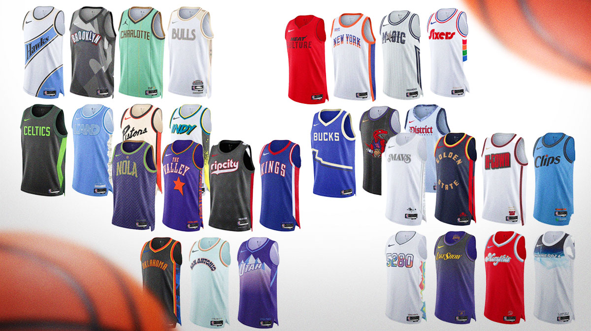
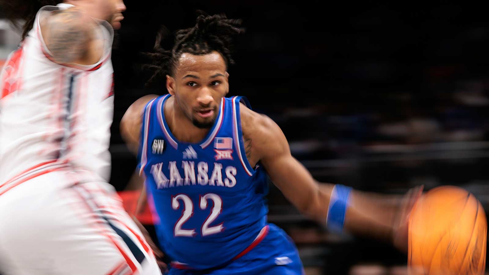
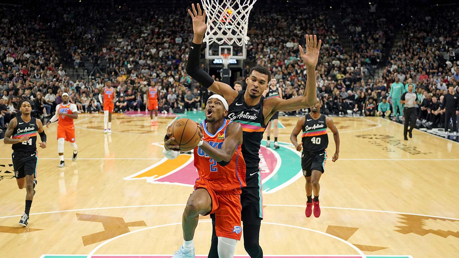
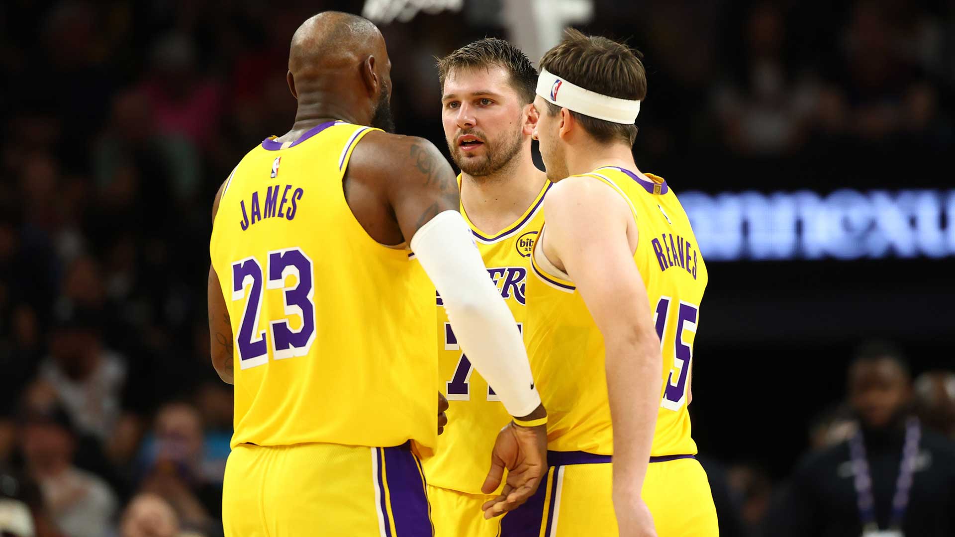
Every season, each NBA team gets a new City Edition jersey. The jerseys are supposed to represent the history and culture of the city in which the teams play. They have gained popularity for typically being flashy and having vibrant jerseys, and the uniqueness of the designs and distinguishability of the looks have made them big sellers historically. However, not all City jerseys hit the same, as evidenced by the fact that fans weren't high on this year's jerseys.
The 2024-25 City Editions were leaked on Twitter/X. in September, and we ranked all 30 jerseys back then accounting for aesthetics, creativeness, and cultural relevance. Now, the the jerseys have officially been revealed, so we can confirm our rankings from before.
1. Charlotte Hornets
When it comes to color schemes, court designs, and uniform aesthetics, the Hornets are always near the top. They once again hit the mark with their 2024-25 City jerseys. The teal jerseys pop, and varying colored dotted stripes that run up the uniform bring great contrast.
2. Cleveland Cavaliers
Completely abandoning your traditional colors in a City jersey is always risky, but the Cavaliers jerseys look great. The typically wine red, gold, and navy blue team went with a light blue main color for their jerseys this year, and it really stands out. However, the main color is far from the best part of the jersey. Additionally, the multi-layered team nameplate that says “The Land” gives a three-dimensional feel, and the graffiti side stripe is one of the coolest jersey features in recent memory.
3. New Orleans Pelicans
The Pelicans have taken some big jersey (and court) risks in recent seasons. Notably, their in-season tournament court last season was one of the most polarizing. That court paid homage to the nightlife of the city of New Orleans, as do their City jerseys this year. These jerseys are less extreme, but they have tons of cool features. The main feature worth discussing is the series of bones that run up the jersey. The look is subtle, but it is unlike anything we've seen on a jersey before and is a great way to highlight some interesting parts about New Orleans, including their iconic above-ground cemeteries.
4. Memphis Grizzlies
The Grizzlies also went with colors completely different than their norm. Despite having a bunch of cool jerseys in the last few years, the Grizzlies busted out a red and white color scheme, and it works. I can easily envision Ja Morant zooming down the court in these jerseys that include their city name, Memphis, in big cursive letters.
5. Denver Nuggets
The Nuggets skyline colors/theme always allows them to have cool jerseys, and they again hit the spot with their 2024-25 City uniforms. While the base white isn't as flashy as Denver has gone before, the heat signature color scheme on both the sides and within the “5280” lettering looks awesome. The 5,280 represents Denver being a mile above sea level.
6. Phoenix Suns
The Suns stuck with the orange and purple valley theme for their 2024-25 City jerseys. The big orange star in the front of the jersey is a fun touch, but it is the Aztec-like print on the side that most stands out.
7. Chicago Bulls
The Bulls, predominantly known for their red jerseys, have gotten a lot of props when they switch things up. Notably, everyone loves the black jerseys from the late '90s, and it was even iconic when the team wore green. Chicago took another chance with something new here, and it worked. The base white jerseys are complemented by cream and tan accents which, give the jerseys a smooth vibe.
8. Toronto Raptors
The old-school Raptors jerseys of the '90s are among the best in NBA history. Everyone loves the dinosaur logo and the zigzag pinstripes. The 2024-25 City jerseys take inspiration from those, and it hits nearly as hard as the originals.
9. Sacramento Kings
Before the Kings were located in Sacramento and rocked the color purple, they played their home games in Kansas City and had a blue and red color scheme. The Kings 2024 City jerseys are simple, but they give a nod to the franchise's history. The old-school feel didn't break any barriers, but it does make for a solid jersey.
10. Utah Jazz
The 2024-25 City jerseys that the Jazz are using are cool, but they are less impressive than their City jerseys from last season. Even so, the purple, blue, and white color scheme of old and the mountain range on the jerseys still land Utah in the top 10 of these rankings. Historically, the Jazz have some of the best jerseys in league history, and these jerseys are similar to what made the team so iconic in the '80s and '90s.
11. Dallas Mavericks
There aren't any flashy colors on the Mavericks City jerseys, but their 2024 City uniforms are still one of the best in the league. The color scheme is white and silver, which gives the jerseys a crisp look. There is also a floral pattern on the sides of the jersey that adds even more to the aesthetic of the jerseys.
12. Philadelphia 76ers
While I'm usually biased against white jerseys, the 76ers uniforms are cool. The lettering catches the eye, but not as much as the multi-colored stripe on the side of the jersey.
13. Los Angeles Clippers
Being one of only two base blue 2024-25 City jerseys probably helps the Clippers' uniforms pop more than they normally would. Still, the light blue always works on Clippers jerseys.
14. Orlando Magic
Pinstripes and the “A” in “Magic” being replaced with a star are staples for Orlando uniforms. These jerseys take inspiration from Magic jerseys of old, but they aren't quite as memorable due to the white base.
15. Detroit Pistons
With there being a lot of white jerseys in this collection of City jerseys, we appreciate that the Pistons went with more of an off-white/cream. The off-kilter Pistons name plate is also a pretty-looking feature.
16. Golden State Warriors
The Warriors jerseys are reminiscent of the “We Believe” Warriors teams that are so nostalgic for so many fans. The dark blue and brown jerseys remind fans of a time before the Warriors organization was a dynasty, but what was an iconic period in franchise history nonetheless.
17. Washington Wizards
For the most part, the Wizards' City jerseys are bland, but they make the top 20 of this list for two reasons. Firstly, “The District” logo is sharp, and secondly, the paint-splattered look on the seams looks cool, although it likely won't be noticeable unless you are really focused on the jerseys.
18. Minnesota Timberwolves
The Timberwolves went with a blue and white water-vibes jersey last year to celebrate the land of 10,000 lakes. The jersey was polarizing last year, and that is again the case this year. The feel for these jerseys is the same but with an inverse of the colors.
19. Oklahoma City Thunder
The black base of the Thunder's City jerseys makes the blue, orange, and yellow accents pop. Other than that, these jerseys are pretty average.
20. San Antonio Spurs
The Spurs fiesta-theme jerseys have the potential to be among the best in the NBA, but instead, the team barely used their flashy colors on their leaked City jerseys. The unnecessary blandness lands them in the 20s on these rankings.
21. New York Knicks
The Knicks used the same jersey design as last year, except with white being the main color and blue and orange being the secondary colors, rather than blue being the main color with orange and black serving as the accent colors. The 3D New York logo is as cool as it was last year, though.
22. Portland Trail Blazers
Subtle features are the best part of the Trail Blazers jerseys. The circle designs that come together to make square designs are a cool touch on these jerseys, but it will be next to impossible to even see that when players are actually playing. When it comes to actual distinguishable features on the jersey, Portland leaves a little to be desired.
23. Houston Rockets
H-town is more than emphasized on the Rockets jerseys. While the big and bold lettering does look good, there isn't much more to these uniforms.
24. Boston Celtics
The Celtics rarely take risks with their jerseys, so we applaud them for doing that this season. However, the brighter-than-usual/neon green just doesn't work great on a Celtics jersey.
25. Atlanta Hawks
The Hawks jerseys aren't bad, they just aren't anything to write home about. The white jerseys have a blue stripe running through the middle of them, which does look good, but they are just missing something to take them to the next level.
26. Indiana Pacers
The Pacers ran it back with the paint-splatter jerseys, but they went with white as the base color this go around. The jerseys had potential, and we respect their uniqueness, but they are simply on the uglier side.
27. Milwaukee Bucks
The Bucks have been going with blue/cream for their City Jerseys for a while now, and it still feels a little weird. It doesn't help that their 2024-25 City jerseys are boring and bland.
28. Miami Heat
The fall off of Miami Heat jerseys has been drastic. From the blue and pink “Vice City” jerseys we once got, fans are now stuck with a plain red uniform that emphasizes the Heat's culture.
29. Los Angeles Lakers
The Lakers used a purple-to-black gradient look, but you can't even tell that there are two colors there. Instead, these city jerseys look boring, and fans will be more excited when they are wearing their traditional gold jerseys.
30. Brooklyn Nets
The Nets' newest jerseys are ugly, and there is no way around it. The city name looks like children's letter blocks, and the rest of the jerseys don't inspire any more sense of maturity. The base of the jerseys is a mix and match of greys and blacks. It not only leaves a lot to be desired, but it is somewhat hard to look at.

