Looking for a fresh take on an old logo, the Milwaukee Brewers took to social media on Nov. 18 to announce that they would be making a special announcement that same evening, with no other details released at that time.
Once 6:30 PM CT hit, fans of the Brewers everywhere were exposed to how they will be looking on the diamond for their 50th anniversary – and it looks to have gone over quite glovingly.
The @Brewers logo lineup. 🔥 pic.twitter.com/ZKwrOgoMrR
— MLB (@MLB) November 19, 2019
Bringing back their old ball and glove logo with a modern twist on it by darkening the blue and tightening up the glove part, the Brewers mixed the old and the new together very well. And with their four new jersey combinations for 2020, the old and the new mix together even better in full form.
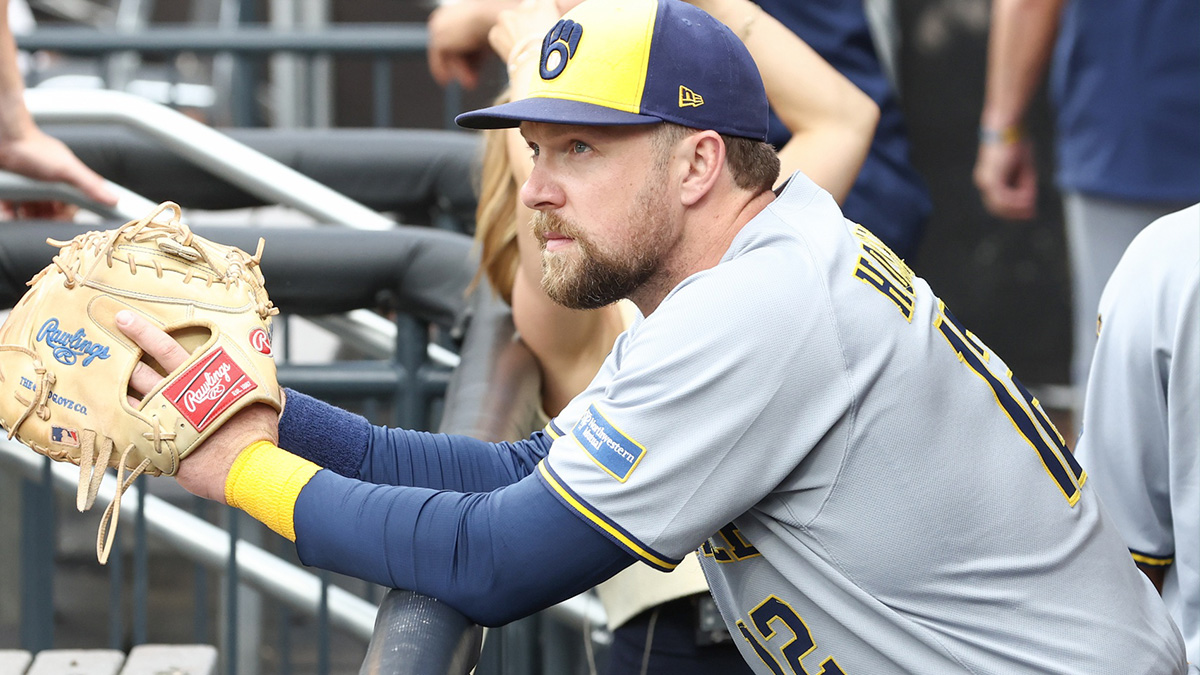
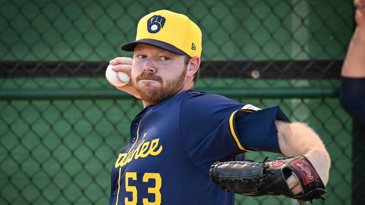
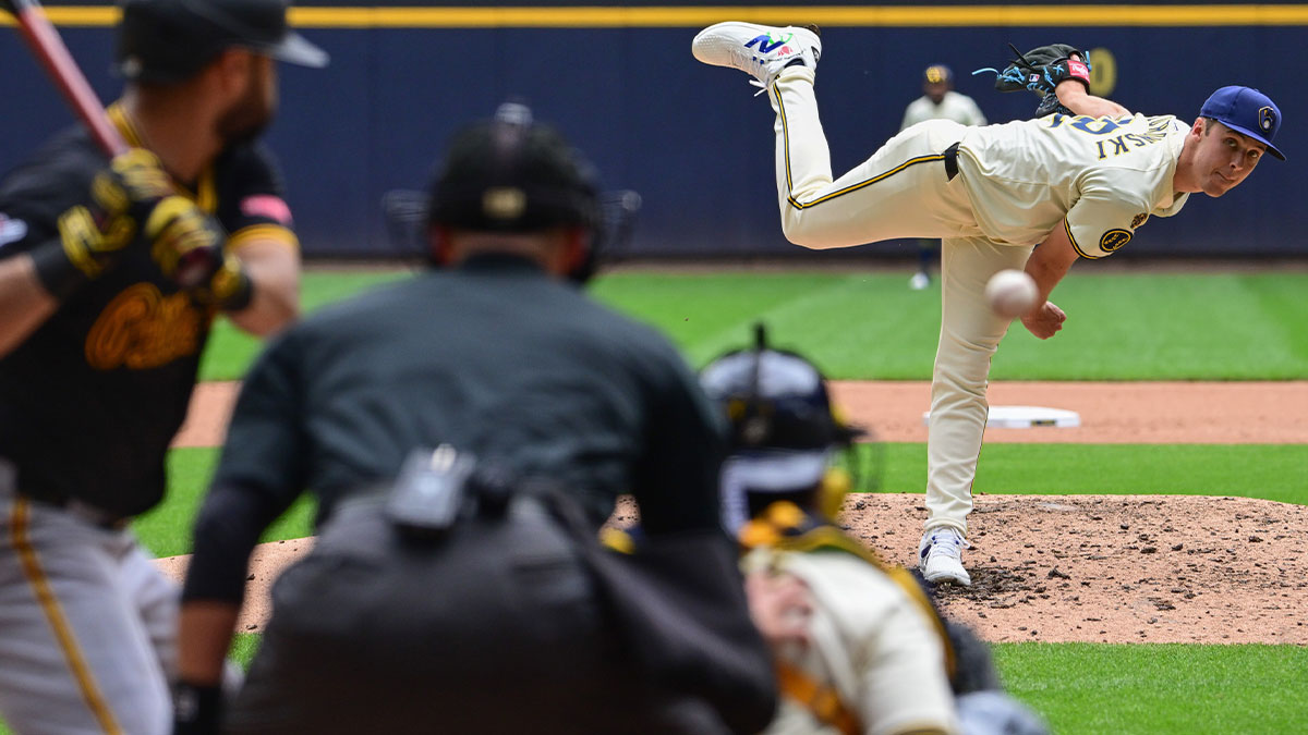
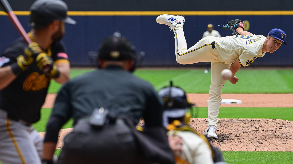
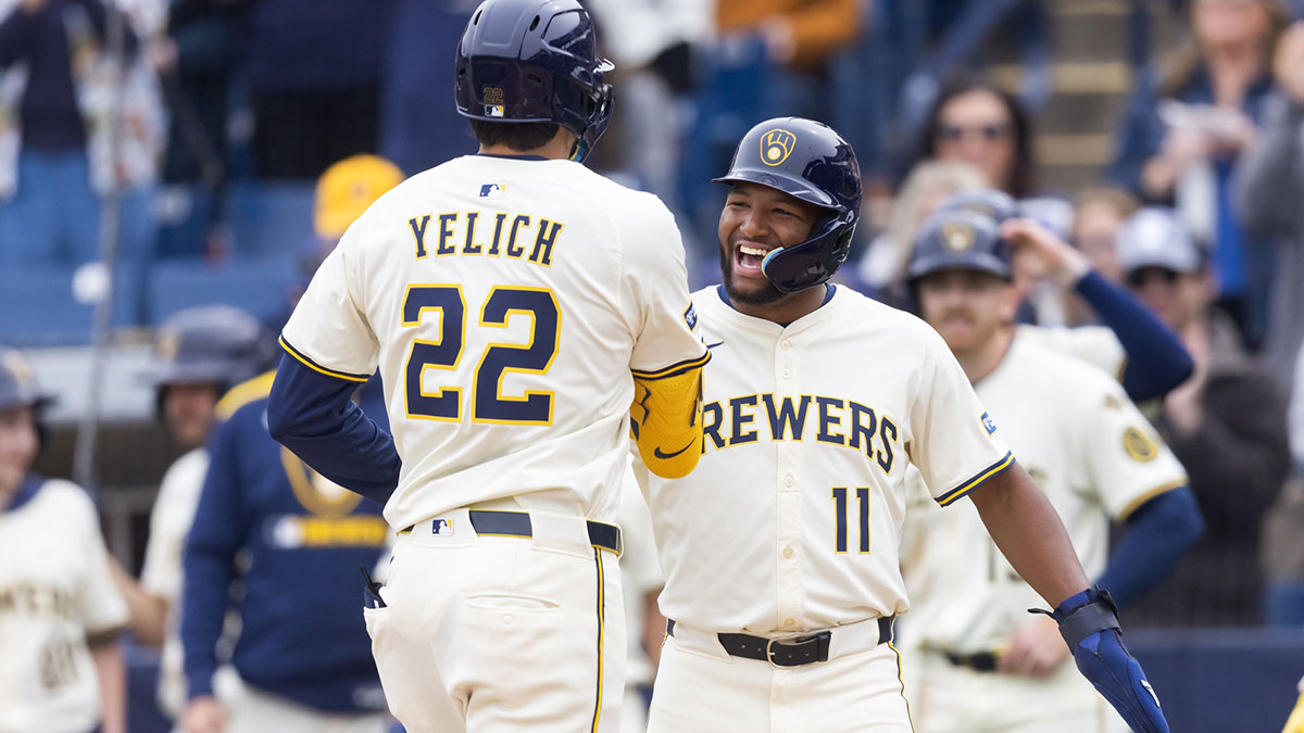
Their home uniform now is a cream-based uniform, with dark blue and gold sitting on the bottom of the sleeves to give them a Seattle Pilots look and feel. With a 50th anniversary and a new wheat laces baseball patch on each arm sleeve, the front of the jersey reads ‘Brewers’ in big navy blue text, outlined in gold to make it pop off the cream canvas.
They will still roll out their classic pinstripes at home for alternate uniforms, which will also be adorned with the previously-mentioned sleeve patches and the Brewers insignia. Unlike their home uniforms, these pinstripes do not have a colored stripe that runs down their pant leg, which is a nice addition for the mainstays at home (navy blue and gold in color).
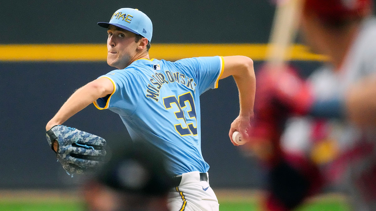
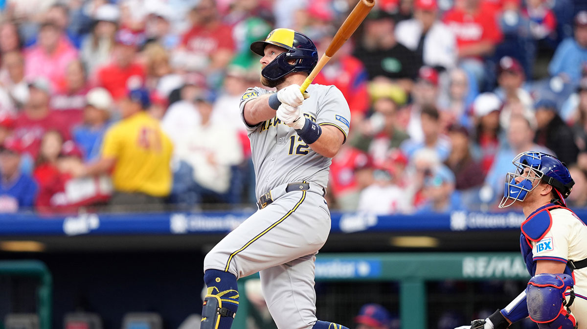
For on the road, their main uniforms will be grey, like previously, but with a twist. The front lettering now reads ‘Milwaukee’ in a slightly smaller size but still in navy blue and gold, and the sleeves have navy and gold endings to them as well.
The pants, just like the home uniforms, have the blue and gold stripes down the pant legs, bringing that aspect from the jersey down to their cleats. The wheat-laced baseball is replaced with a Wisconsin cutout with bricks lining the inside of the state picture with a big letter ‘M’ in navy in the middle of the state, showing how this team has been built up brick-by-brick.
Their fourth and final uniform combination is the boldest of the four but still holds true to their historical flare. With a navy blue base and yellow stripes riding down on the outsides of the buttons, the sentence-case ‘Milwaukee’ reads in cursive script, and the bright gold color jumps off of its dark background, mixing well with the 50th-anniversary patch and the Wisconsin ‘M’ insignia.
Having already started the process of rebranding Miller Park, which will be renamed to incorporate the team’s new partnership with American Family Insurance, the Brewers are looking to join the ranks of impressive rebranded uniforms for a long-standing franchise. And with the steps that they have already taken, this franchise looks to be well on their way.